
For as long as we can remember, newsrooms have used data to support their stories. Whether it's elections, global warming, or Oscar predictions, writers and reporters dig deep for facts and statistics that'll add credibility to their claims.
However, in recent years, data journalism has become the norm in almost every industry. And as a result, the need for data journalists continues to rise -- companies like Priceonomics, Pandora, and many more digital agencies are all looking for people that aren't afraid to get their hands dirty with numbers and charts.
If you're not familiar with the concept of data journalism, you're not out of luck. In fact, you're the right place. To help business understand the value of this approach, I've done some research myself.
Below you'll find helpful information surrounding what data journalism is, what data journalists do, and how you can get started.
What is Data Journalism?
Data journalism is a specialized practice that involves the discovery and distribution of news, with a heavy focus on analysis, data visualization, and storytelling.
A brief history of data journalism:
One of the earliest examples of data journalism was seen in one of the very first editions of The Guardian in 1821. The bound volume included a table of leaked data from all the schools in Manchester, the number of students (by gender), and the cost of education.
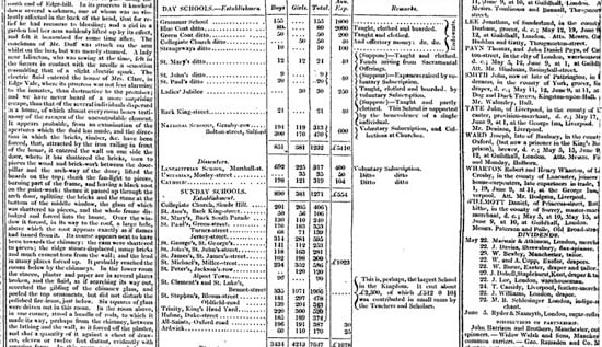
Image Credit: Data Journalism Handbook
This was the first time the public had been exposed to this type of information, and the author of the piece suggested that this type of data transparency -- while controversial at the time -- would be necessary moving forward if they wished to improve current conditions and processes.
If you fast forward to 1950s, you can see how the introduction of computers -- specifically the UNIVAC -- helped to more dramatically shift the focus of traditional journalism. For example, one of the first instances of computer-assisted reporting (CAR)was during the 1952 presidential election, where CBS News used the machine's calculation of election results in their broadcast.
And by the early 1970s, the term precision journalism surfaced as a way to describe a new way of looking at news-gathering -- one that was rooted in scientific techniques, data collection, and thoughtful analysis. According to Philip Meyer, who went on to author a book about the practice, this type of new perspective was needed to help journalists establish both objectivity and truth.
"Precision journalism was a way to expand the tool kit of the reporter to make topics that were previously inaccessible, or only crudely accessible, subject to journalistic scrutiny," Meyer explained.
Thanks to the wealth of information available today, data journalism continues to evolve and expand. With the help of visual tools such as infographics and interactive charts, journalists have become more sophisticated storytellers -- using data to inform a majority of their work.
So, What Do Data Journalists Do?
The general role of data journalists is to create data-backed content that sheds light on facts, interesting trends, and trivia. A data journalist could be a writer, economics writer, data scientist, data visualizer, or even just a data nerd.
And as a result of the level of content saturation on the internet, data journalism is no longer restricted to big publishing companies and newsrooms. While business of all shapes and sizes continue to seek out opportunities to create better, more informative content, they're beginning to explore different tools and formats for conveying information.
With an emphasis on in-depth research and lateral thinking, data journalists are able to cut through the content clutter and information overload. But there's more to the job than that ...
They use data in myriad ways.
First things first, let’s bust some myths. Data journalism is not always intellectual, thought provoking, or disruptive in nature.
In fact, there is a huge potential for sites that publish content -- no matter what the topic may be -- to infuse their information with statistics and compelling, supporting visuals.
For example, a group of students from Technical University of Munich built a Game of Thrones-inspired website called A Song of Ice and Data to geek out over the statistical side of the show's plot lines:
We wanted to tell some of the Game of Thrones stories using data that we acquire on the web. Many fans of the Ice and Fire books and of the HBO show have amassed a lot of data about the plot, the characters, the great houses of westeros, the history and culture of the world of Ice and Fire, and in general anything you can think about this cultural phenomenon."
And that's exactly what they do. Check it out:

They don’t always rely on numbers.
Data journalism is much more than fumbling with Excel sheets and number crunching. In fact, in some cases, it doesn't have to be rooted in numbers at all.
For example, in this piece for The New York Times, the author has done extensive research on ‘whitewashing’ in Hollywood to make a case for Asian-American's lack of visibility on screen.

Rather than focusing solely on numbers, the piece includes quotes from Asian actors, cites examples of various movies, and talks about Twitter trends like #whitewashedOUT.
So while data journalism requires writers to dig through data to uncover statements, sentiments, or credible information that can be used as supporting evidence, it doesn't have to focus on numbers alone.
They make data appealing or interactive.
In most cases, data-rich content works better when it is visually appealing or interactive. After all, the brain processes visual information 60,000 times faster than it does text.
With this in mind, many companies have used data to create compelling interactive content. For data journalists, this is where coding, visualizing, and a keen sense of design and UX comes into the picture.
A great example of this comes from the folks at ConcertHotels, who researched the history of rock to create an awesome piece of content that displays 100 years of rock music by year.

As you scroll down and click on each, a sample music plays. They've sorted the music pieces by year -- and color-sorted the data to make it more clear.
The lesson? Sometimes people need more than simple pie charts and graphs to understand data. Data journalists get that. And as a result, they must continuously hone their design and development skills. (Looking for some tools to help you get your design skills in gear? Check out this post.)
They know how to tell a story.
The best data journalists are also skillful storytellers. They know how to distill information to create a clear and convincing narrative.
If I told you that 5000+ people have died in New Jersey because of heroin, you'd probably be surprised. But would that number alone be enough to really move you?
Probably not.
Now, what if I made you scroll past tombstones upon tombstones with the names and ages of the people who died? Would that make an impact?
Well, that's exactly what NJ.com did ...

[Click here to view the entire visual]
Pretty alarming, isn't it?
That's what makes it such a great example of data journalism. It tells a powerful story without having to relying on a ton of written words. It's simple, yet impactful.
What Resources Do I Need for Data Journalism?
The internet is full of resources to provide you with data of all types and sizes.
You have data tools that can help you drill down data to the last pixel. You have data visualization tools that help you make sense of data chaos. You have predictive tools that throw light on future trends. At the end of the day, the possibilities in today’s data-driven world are endless.
To help you get started, here are a few basic tools to explore ...
Data/Research
- Pew Research
- UNdata
- Data.gov
- U.S. Census Bureau
- Statista
- Stats.org
- HubSpot Research
- Google Trends
- SocialMention
Data Visualization
(Check out this post for even more data visualization tools and resources.)
Have you experimented with data journalism? Share your thoughts and experiences in the comments below.
No comments:
Post a Comment