There is only one danger more deadly to an online marketer than ignorance, and that danger is misplaced confidence.
Whenever a marketer omits regular statistical significance testing, they risk infecting their campaigns with dubious conclusions that may later mislead them. But because these conclusions were based on “facts” that the marketer “empirically” observed with their own two eyes, there is scant possibility that these erroneous ideas will ever be revisited, less questioned.
The continued esteem given to these questionable conclusions causes otherwise sane marketers to irrationally believe their sterile photos to be superior, their shoddy headlines to be superb, and their so-so branding to be sublime.
Statistical significance testing is the cure to this woe. There are math courses aplenty that describe this field, but the world has no need for another. Today, I propose something different: a crash course in the necessary intuition. The goal of this piece, then, is to instil in you a series of “a-ha” moments that’ll make statistical significance click all while sending warm, fuzzy rushes of understanding into your mind.
Epiphany #1: Large sample sizes dilute eccentricity
Imagine you see a book rated an “average” of 5 stars on Amazon. If this average was based on the review of only a single reader, you would hardly think this book better than another which was rated lower (say 4.2 stars), albeit on the back of hundreds of reviews. Common sense informs you that the book with one rating might have been reviewed by a reader who, for purely idiosyncratic reasons, happened to adore it. But you, as a cautious potential purchaser, cannot tell whether that single review was more reflective of the reviewer rather than the book. Without further information, you cannot be confident of the book’s quality.
As you can see with this Amazon book review example, small sample sizes give eccentricity a chance to express itself. It’s for this exact same reason that an advertising campaign report containing only five clicks makes for an unreliable source of truth. Here, it’s possible that those five advert-clickers were oddly passionate fans of your product who happened to see your advert at the right time. The excellent results your advertising campaign seemed to enjoy may, in reality, have just been a fluke.
The intuitive idea we have just seen has not gone unnoticed by mathematicians. They have indeed packaged it up with a delightfully self-explanatory name: “The Law of Large Numbers”.
Epiphany #2: P-values are trade-offs between certainty and experiment length
Imagine a gambler who bets his house on a coin being rigged. We would pity his stupidity if he bet after seeing a coin land “heads” only three times in a row. But no-one would doubt this mental acuity if the coin had instead landed “heads” a million times in a row. Intuitively—and indeed mathematically—this is a sound bet.
But notice that the gambler is still betting. He can never be fully, totally, and absolutely certain that the coin is rigged. Even after seeing a million “heads” in a row, there is still an infinitesimal yet nevertheless existent chance that a fair coin could have given the result of “a million heads in a row”. But, practically speaking, this is exceedingly unlikely, so the gambler shouldn’t let such a tiny shard of uncertainty deter him from making a fundamentally sound bet.
Now we have two extremes: flipping a coin three times, after which it is too early to make a confident bet; and flipping a coin a million times, after which it is exceedingly secure to bet. But what if our gambling man has a family wedding to attend that afternoon. He still wants to bet on the coin in confidence, but he doesn’t want to wait around until it has been flipped “heads” a million times in a row. Translated into the business context, what if we, as advertisers, don’t want to continue our Puppies vs Kitten Photo A/B test for 10 years before deciding which photo was better for sales? By waiting that long, we would have wasted 10 years in showing a proportion of our customers a photo that was comparatively ineffective at effecting sales. Had we figured out which photo was better earlier on, we could have had our best foot forward for a much longer period and earned higher profits all that while.
The crux of the matter is this: There is a trade-off between certainty and experiment length. We can see this intuitively by considering how our feelings of confidence would develop after an increasingly long series of coin flips. After 1 flip of “heads”, none of us would suspect the coin of being rigged. After 5 flips, we’d start seriously entertaining the thought. After 10 flips, most of us would strongly suspect it, but perhaps not enough to bet the house on it. After 100 flips, little doubt could remain in our minds, and we’d feel confident about making a serious wager. After 1,000 flips, we’d be screaming at the top of our lungs for the bookie to take our money.
As we have seen, the more consecutive “heads” flips we witnessed landing, the more certain we’d feel about the coin being rigged. But given that we are not immortal and that we will never reach 100% certainty with anything in our lives, we all must choose a pragmatic point where our uncertainty reaches a tolerably low level, a point where we put our hands up and say, “I’ve seen enough—let’s do this thing”.
This trade-off point is quantified by statisticians with a figure they dub the p-value. Very roughly speaking, the p-value corresponds to the chance you have of being wrong about your conclusion. The p-value can thus be thought of as a preference, one that represents your desired trade-off between certainty and experiment length. Typically, marketers set their p-value to .05, which corresponds to having a 1 in 20 chance of being wrong. If you are risk averse about making mistakes, you could set your p-value to .01, which would mean you have only a 1 in 100 chance of being wrong (but your experiment would take much longer to attain this heightened level of certainty).
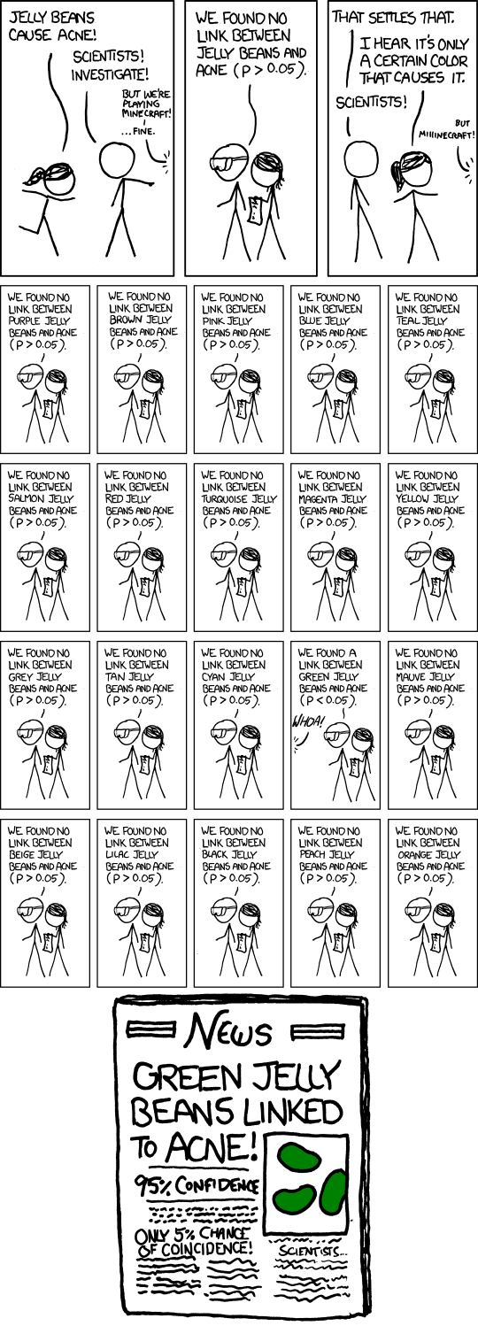
Perhaps no industry is as wedded to the use of p-values as the pharmaceutical industry. As Ben Goldacre points out in his chilling book, Bad Pharma, there is terrible potential for the pharmaceutical industry to hoodwink doctors and patients with p-values. For example, a p-value of .05 means that one trial in 20 will incorrectly show a drug to be effective, even though, in actuality, that drug is no better than placebo. A dodgy pharmaceutical company could theoretically perform 20 trials of such a drug, bury the 19 trials showing it to be rubbish, then proudly publish the one and only study that “proves” the drug works.
For the same probabilistic reasons, the online marketer who trawls through their Google AdWords/Facebook Ads/Google Analytics reports looking for patterns runs a big risk of detecting trends and tendencies which don’t really exist. Every time said marketer filters their data one way or the other, they are essentially running an experiment. By sheer force of random chance, there will inevitably be anomalies, anomalies which the marketer will then falsely attribute to underlying pattern. But these anomalies are often no more special than seeing a coin land “heads” five times in a row in 1/100 different experiments where you flipped five fair coins.
Epiphany #3: Small differences in conversion rates are near impossible to detect. Large ones, trivial.
Imagine we observed the following advertising results:
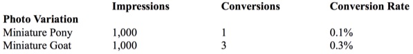
Upon eyeballing the data, we see that the goat variant tripled its equestrian competitor’s conversion rate. What’s more, we see that there was a large number of impressions (1,000) in each arm of the experiment. Is this enough to satisfy the aforementioned “Law of Large Numbers” and give us the certainty we need? Surely these data mean that the “Miniature Goat” is the better photo in a statistically significant way?
Not quite. Without going too deep into the math, these results fail to reach statistical significance (where p=.05). If we concluded that the goat was the better photo, we would have a 1 in 6 chance of being wrong. Our failure to reach statistical significance despite the large number of impressions shows us that impressions alone are insufficient in our quest for statistically significant results. This might surprise you. After all, if you saw a coin land “heads” 1,000 times in a row, you’d feel damn confident that it was rigged. The math of statistical significance supports this feeling—your chances of being wrong in calling this coin rigged would be about 1 in 1,000,000,000,000,000,000,000,000,000,000… (etc.)
So why is it that the coin was statistically significant after 1,000 flips but the advert wasn’t after 1,000 impressions? What explains this difference?
Before answering this question, I’d like to bring up a scary example which you’ve probably already encountered in the news: Does the use of a mobile phone increase the risk of malignant brain tumors? This is a fiendishly difficult question for researchers to answer, because the incidence of brain tumours in the general population is (mercifully) tiny to start off with (about 7 in 100,000). This low base incidence means that experimenters need to include absolutely epic numbers of people in order to detect even a modestly increased cancer risk (e.g., to detect that mobile phones double the tumour incidence to 14 cases per 100,000).
Suppose that we are brain cancer researchers. If our experiment only sampled 100 or even 1,000 people, then both the mobile-phone-using and the non-mobile-phone-using groups would probably contain 0 incidences of brain tumours. Given the tiny base rate, these sample sizes are both too small to give us even a modicum of information. Now suppose that we sampled 15,000 mobile phone users and 15,000 non-users (good luck finding those).
At the end of this experiment, we might count two cases of malignant brain cancer in the mobile-phone-using group and one case in the non-mobile-using group. A simpleton’s reading of these results would conclude that the incidence of cancer (or the “morbid conversion rate”) with mobile phone users is double that of non-mobile-phone users. But you and I know better, because intuitively this feels like too rash a conclusion—after all, it’s not that difficult to imagine that the additional tumor victim in the mobile-phone-using group turned up there merely by random chance. (And indeed, the math backs this up: this result is not statistically significant at p=.05; we’d have to increase the sample size a whopping 8 times before we could detect this difference.)
Let’s return to our coin-flipping example. Here we only considered two outcomes—that the coin was either fair (50% of the time it lands “heads”) or fully biased to “heads” (100% of the time it lands “heads”). Phrasing the same possibilities in terms of conversion rates (where “heads” counts as a conversion), the fair coin has a 50% conversion rate, whereas the biased coin has a 100% conversion rate. The absolute difference between these two conversion rates is 50% (100% – 50% = 50%). That’s stonking huge! For comparison’s sake, the (reported) difference between the miniature pony and miniature goat photo variants (from the example at the start of this section) was only .2%, and the suspected increase in cancer risk for mobile phone users was .01%.
Now we get to the point: It is easier to detect large differences in conversion rates. They display statistical significance “early” (i.e., after fewer flips or fewer impressions, or in studies relying on smaller sample sizes). To see why, imagine an alternative experiment where we tested a fair coin against one ever so slightly biased to “heads” (e.g., one that lands “heads” 51% of the time). This would require many, many coin flips before we would notice the slight tendency towards heads. After 100 flips we would expect to see 50 “heads” with a fair coin and 51 “heads” with the rigged one, but that extra “heads” could easily happen by random chance alone. We’d need about 15,000 flips to detect this difference in conversion rates with statistical significance. By contrast, imagine detecting the difference between a coin biased 0% to “heads” (i.e., always lands “tails”) and one biased 100% to “heads” (in other words, imagine detecting a 100% difference in conversion rates). After 10 coin flips we would notice that the results would be either ALL heads or ALL tails. Would there really be much point in continuing to flip 90 more times? No, there would not.
This brings us to our next point, which is really just a corollary of the above: Small differences in conversion rates are near impossible to detect. The easiest way to understand this point is to consider what happens when we compare the results of two experimental variants with identical conversion rates: After a thousand, a million, or even a trillion impressions, you still won’t be able to detect a difference in conversion rates, for the simple reason that there is none!
Bradd Libby, of Search Engine Land, calculated the rough number of impressions necessary in each arm of an experiment to reach statistical significance. He then reran this calculation for various different click-through rate (CTR) differences, showing that the smaller the expected conversion rate difference, the harder it is to detect.
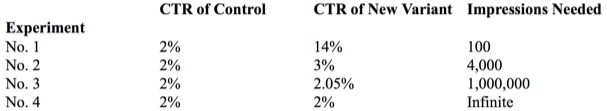
Notice how in the final row an infinite number of impressions are needed; as we said above, we will never detect a difference, because there is none to detect. The consequence of all this is that it’s not worth your time, as a marketer, to pursue tiny expected gains; instead, you’d be better off going for a big win that you have a chance of actually noticing.
Epiphany #4: You destroy a test’s validity by pulling the plug before its preordained test-duration has passed
Anyone wedded to statistical rigour ought to think twice about shutting down an experiment after perceiving what appears to be initial promise or looming disaster.
Medical researchers, with heartstrings tugged by moral compassion, wish that every cancer sufferer in a trial could receive what’s shaping up to be the better cure—notwithstanding that the supposed superiority of this cure has yet to be established with anything approaching statistical significance. But this sort of rash compassion can have terrible consequences, as happened in the history of cancer treatment. For far too long, surgeons subjected women to a horrifically painful and disfiguring procedure known as the ‘radical mastectomy‘. Hoping to remove all traces of cancer, doctors removed the chest wall and all axillary lymph nodes, along with the cancer-carrying breast; it later transpired that removing all this extra tissue brought no benefit whatsoever.
Generally speaking, we should not prematurely act upon the results of our tests. The earlier stages of an experiment are unstable. During this time, results may drift in and out of statistical significance. For all you know, two more impressions could cause a previous designation of “statistically significant” to be whisked out from under your feet. Moreover, statistical trends can completely switch direction during their run-up to stability. If you peep at results early instead of waiting until an experiment runs its course, you might leave with a conclusion completely at odds with reality.
For this reason, it’s best practice not to peek at an experiment until it has run its course—this being defined in terms of a predetermined number of impressions or a preordained length of time (e.g., after 10,000 impressions or two weeks). It is crucial that these goalposts be established before starting your experiment. If you accidentally happen to view your results before these points have been passed, resist the urge to act upon what you see or even to designate these premature observations as “facts” in your own mind.
Epiphany #5: “Relative” improvement matters, not “absolute” improvement
Look at the following table of data:

After applying a statistical significance test, we would see that the 80s rocker photo outperforms the 60s hippy photo in a statistically significant way. (The numerical details aren’t relevant for my point so I’ve left them out.) But we need to be careful about what business benefit these results imply, lest we misinterpret our findings.
Our first instinct upon seeing the above data would be to interpret it as proving that the 80s rocker photo converted at a 16% higher rate than the 60s hippy photo, where 16% is the difference by subtraction between the two conversion rates (30% – 14% = 16%).
But calculating the conversion rate difference as an absolute change (rather than a relative change) would lead us to understate the magnitude of the improvement. In fact, if your business achieved the above results, a switch from the incumbent 60s hippy pic to the new 80s rocker pic would cause you to more than double your number of conversions, and, all things being equal, you would, as a result, also double your revenue. (Specifically, you would have a 114% improvement, which I calculated by dividing the improvement in conversion rates, 16%, by the old conversion rate, 14%.) Because relative changes in conversion rates are what matter most to our businesses, we should convert absolute changes to relative ones, then seek out the optimisations that provide the greatest improvements in these impactful terms.
Epiphany #6: “Statistically insignificant” does not imply that the opposite result is true
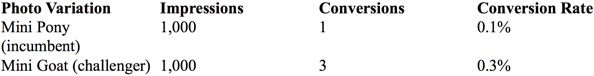
What exactly does it mean when some result is statistically insignificant? The example below has a p-value of approx .15 for the claim that the Mini Goat photo is superior, making such a conclusion statistically insignificant.
Does the lack of statistical significance imply that there is a full reversal of what we have observed? In other words, does the statistical insignificance mean that the “Miniature Pony” variant is, despite its lower recorded conversion rate, actually better at converting than the “Miniature Goat” variant?
No, it does not—not in any way.
All that the failure to find statistical significance says here is that we cannot be confident that the goat variant is better than the pony one. In fact, our best guess is that the goat is better. Based on the data we’ve observed so far, there is an approximately 85% chance that this claim is true (1 minus the p-value, .15 = .85). The issue is that we cannot be confident of this claim’s truth to the degree dictated by our chosen p-value—to the minimum level of certainty we wanted to have.
One way to intuitively understand this idea is to think of any recorded conversion rate as having its own margin of error. The pony variant was recorded as having a .1% conversion rate in our experiment, but its confidence interval might be (using made-up figures for clarity) .06% above or below this recorded rate (i.e., the true conversion rate value would be between .04% and .16%). Similarly, the confidence interval of the goat variant might be .15% above or below the recorded .3% (i.e., the true value would be between .15% and .45%). Given these margins of error, there exists the possibility that the pony’s true conversion rate would be at the high end (.16%) of its margin of error, whereas the goat’s true conversion rate would lie at its low end (.15%). This would cause a reversal in our conclusions, with the pony outperforming the goat. But in order for this reversal to happen, we would have had to take the most extreme possible values for our margins of error—and in opposite directions to boot. In reality, these extreme values would be fairly unlikely to turn up, which is why we say that it’s more likely that goat photo is better.
Epiphany #7: Any tests that are run consecutively rather than in parallel will give bogus results
Statistical significance requires that our samples (observations) be randomised such that they fairly represent the underlying reality. Imagine walking into a Republican convention and polling the attendees about who they will vote for in the next US presidential election. Near everyone in attendance is going to say “the Republican candidate”. But it’s self-evident that the views of the people in that convention are hardly reflective of America as a whole. More abstractly, you could say that your sample doesn’t reflect the overall group you are studying. The way around this conundrum is randomisation in choosing your sample. In our example above, the experimenter should have polled a much broader section of American society (e.g., by questioning people on the street or by polling people listed in the telephone directory.) This would cause the idiosyncrasies in voting patterns to even out.
If you ever catch yourself comparing the results of two advertising campaigns that ran one after the other (e.g., on consecutive days/weeks/months), stop right now. This is a really really bad idea, one that will drain every last ounce of statistical validity from your analyses. This is because your experiments are no longer randomly sampling. Following this experimental procedure is the logical equivalent of extrapolating America’s political preferences after only asking attendees of a Republican convention.
To see why, imagine you are a gift card retailer who observed that 4,000% as many people bought Christmas cards the week before Christmas compared to the week after. You would be a fool if you concluded that the dramatic difference in conversion rates between these two periods was because the dog photo you advertised with during the week preceding Christmas was 40 times better at converting than the cat photo used the following week. The real reason for the staggering difference is that people only buy Christmas cards before Christmas.
Put more generally, commercial markets contain periodic variation—ranging in granularity from full-blown seasonality to specific weekday or time of day shopping preferences. These periodic forces can sometimes fully account for observed differences in conversion rates between two consecutively run advertising campaigns, as happened with the Christmas card example above. The most reliable way to insulate against such contamination is to run your test variants at the same time as one another, as opposed to consecutively. This is the only way to ensure a fair fight and generate the data necessary to answer the question ‘which advert variant is superior?’ As far as implementation details go, you can stick your various variants into an A/B testing framework. This will randomly display your different ads, and once the experiment ends you simply tally up the results.
Perhaps you are thinking, “My market isn’t affected by seasonality, so none of this applies to me”. I strongly doubt that you are immune to seasonality, but for argument’s sake let’s assume your conviction is correct. In this case, I would still argue that you have a blind spot in that you are underestimating the temporally varying effect of competition. There is no way for you to predict whether your competitors will switch on adverts for a massive sale during one week only to turn them off during the next, thereby skewing the hell out of your results. The only way to protect yourself against this (and other) time-dependent contaminants is to run your variants in parallel.
Conclusion
Having been enlightened by the seven big epiphanies for understanding statistical significance, you should now be better equipped to pull up your sleeves and dig into statistical significance testing from a place of comfortable understanding. Your days of opening up Google AdWords reports and trawling for results are over; instead, you methodically set up parallel experiments, let them run their course, choose your desired trade-off for certainty vs. experimental time, give adequate sample sizes for your expected conversion rate differences, and calculate business impact in terms of relative revenue differences. You will no longer be fooled by randomness.
About the Author: Jack Kinsella, author of Entreprenerd: Marketing for Programmers.
No comments:
Post a Comment