
It's no secret that creative agencies aren't big fans of the pitch deck.
Gene Liebel, the founder of New York-based agency Work & Co, summed up his feelings about pitch decks pretty straightforwardly: "They're the worst."
Pitch decks have become increasingly reviled in recent years, with many agencies declaring their restrictive and unengaging format as an inherent enemy of creativity. As one anonymous agency millennial told Digiday, pitch decks can cause "you [to] think differently ... like if an idea doesn’t fit in a neat little bullet point or a clean slide, it's not good."
Despite the general animosity towards pitch decks, they aren't going to go away overnight. Not every pitch your agency makes is going to come in the form of a crazy stunt. Sometimes, a pitch just demands a straightforward, no-frills presentation. And you've got to bite the bullet, swallow your creative pride, and open PowerPoint.
Designing a solid, persuasive pitch deck that won't put your audience to sleep is easier said than done. People are notoriously terrible at focusing on slide-by-slide presentations, so your deck needs to cut through the clutter and communicate your points in a way that your audience can understand with minimal effort.
To help make your next pitch a tolerable -- maybe even enjoyable -- experience for everyone, we've put together a list of six basic guidelines for designing engaging decks.
How to Design a Pitch Deck that Doesn't Suck
1) Make your text extremely legible.
That guy who forgot to wear his contacts today and somehow ended up in the back row of the conference room? Yeah, he needs to be able to see your slides just as well as everyone else.
The significance of creating extremely legible, easy-to-read slides should not be underestimated. It's more than a matter of aesthetics: If your slides are at all difficult to read, even people with 20/20 vision are going to quickly lose interest and zone out.
They didn't come here to expend effort -- they came here to be spoon-fed. And it's your job to make your information as digestable as possible. To keep the focus on your content, stick to big, bold fonts on highly-contrasting backgrounds.
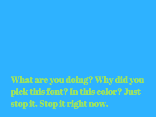
Don't do this:
This font color doesn't contrast enough with the background, and the text size isn't large or clear enough to be read comfortably from a distance. Don't make your poor audience stare at this for too long.
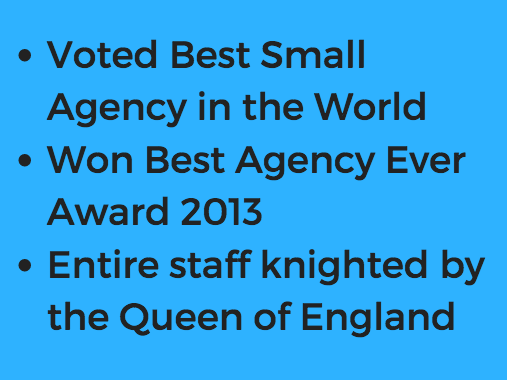
Do this:
This font is big and bold enough to be seen from the back of the room, and it contrasts well with the background. When all else fails, a bold sans-serif font is the way to go.

2) Tell a story.
When we process information in list format, the basic language-processing areas of our brains get activated. Scientists call these sections Broca's area and Wernicke's area, and they're responsible for translating words we see or hear into coherent meanings -- but they don't help us stay interested or retain information. In other words, bullet points don't usually produce a very exciting reaction in our brains, leaving the rest of our minds to wander.
When our brains are given a story instead of a list, things change -- big time. Stories engage more parts of our brains, including our sensory cortex, which is responsible for processing visual, auditory, and tactile stimuli. If you want to keep people engaged during a presentation, tell them a story.
"A story takes all the senseless data that the world provides and turns it into something meaningful," said Jonah Sachs, the creative director of the communications firm Free Range Studios and author of Winning the Story Wars. Centering you presentation around a story, instead of a list of facts or figures, is essential for keeping people interested and leaving a lasting impression.
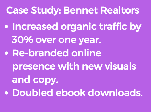
Don't do this:
This information might be impressive, but it isn't likely to stick with your audience when presented in list form.
Do this:
Weaving your impressive case study into a story is much more likely to have an impact on the audience.

3) Break everything down into extremely simple parts.
When it comes to pitch decks, it's time to wean yourself off of bullet points. Although they're still better than slapping a dense paragraph of text onto a slide and calling it a day, they can be overwhelming, and prevent your audience from really absorbing your main points.
You might think you're already simplifying your content, but take it a step further. Each slide should convey a single, simple idea -- not a multiple ideas, not a multi-faceted idea, and not an idea that requires a degree in rhetoric to meticulously decode.
If it seems like you're making things way too simple, then you're on the right track. Remember: not all your talking points need to occupy real estate on your slide deck. Save the slide space for the big ideas, and talk your way through the rest.
Don't do this:
These points might seem simple, but they could be broken down even further and separated onto different slides.
Do this:
There's nothing difficult to understand about this simple, straightforward slide.

4) Make the points obvious.
The point of each slide should be obvious. Your audience shouldn't have to work to understand what's going on, especially when graphs or charts are involved.
Any information you include on a slide should be immediately translated for the audience, even if you think it speaks for itself. Ask yourself:
- What point are you trying to make by including this piece of information?
- How does this fact or figure connect back to your main premise?
- What do you want the audience to get out of this slide?
Don't do this:
While this graph clearly shows growth, the point doesn't obviously tie back to your premise.

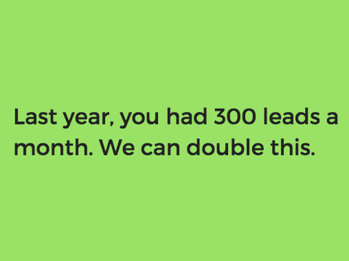
Do this:
The title on this slide tells the audience exactly what they should take away from the graph, directing them immediately to the conclusion that benefits your cause.

5) Focus on the prospect's challenges, not yourself.
It's safe to assume that your prospect has spent some time researching your agency, so there's no need to waste valuable presentation time talking about your accomplishments or accolades.
You aren't just convincing the audience you're amazing at your job -- you're convincing them that you understand them, and that you're the best person to help them overcome their unique challenges.
The business pitch consultants at Blue Lobster recommend asking yourself a few questions to focus your presentation around your audience:
- Who is the audience?
- What is their problem?
- How can you help?
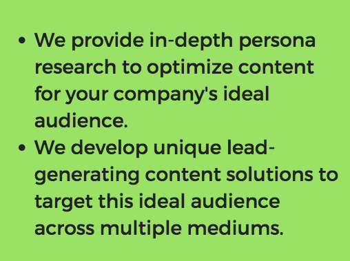
Don't do this:
While this is all very impressive, it doesn't express an understanding of your client's problems or delve into how you can help them. Plus, your prospect probably already found this information from a quick scan of your agency's website.
Do this:
This slide shows that you've done your research, and expresses a clear value proposition to the prospect.
6) Supplement your deck with additional materials.
Even when it makes sense to use a pitch deck, you don't need to spend the whole presentation talking at your audience. "We expect teams to use presentations as a visual aid to a narrative or conversation between them and their audience, not as prose-focused documents to be read," said KBS co-president Matt Powell.
Powell encourages his agency's team to supplement classic pitch decks with additional materials, such as "handouts, prototypes or posters to encourage discussion so the presentation and the presentation deck are not seen as one and the same."
To keep your audience receptive and awake, consider adding some of these more engaging elements throughout the presentation.
What is your agency's stance on pitch decks? How do you keep them fresh and interesting? Let us know in the comments.
No comments:
Post a Comment