Uber might be King of Growth Hacking.
The one everyone fawns over. The media adores. Growth Hackers join.
But these kind of companies are the exceptions.
Their ascent so quick and scale so massive that the vast majority of us can’t play by the same rules.
Instead, we need to look around. At the regular companies. One’s who’re grinding out, day-to-day, trying to get as many paying customers as possible.
Unbelievably, one perfect example emerges. From the least likely of places.
The grandma-catering QVC serves as an exemplary model for increasing site conversions. No matter what industry you’re in.
Here’s why and what they’re doing so well.
How QVC is a Conversion Juggernaut
One day I was researching the top converting websites online.
The usual suspects were there.
You expect Amazon.
Walmart or Expedia.
But not this. Not them.
A home shopping network. The same tired, old format you see on late night infomercials.
Not the QVC, whose primary audience demographic consists of your grandparents and… well, that’s gotta be pretty much it.
Curious, I had to check them out.
And sure enough, what I saw blew me away.
What makes QVC a conversion master? The blueprint you should follow with underlying sales principles that should be adapted for your own site immediately?
Let’s start with the homepage.
#1. QVC Homepage
First things first. Checkout the QVC homepage and you’re met with their latest daily deal.
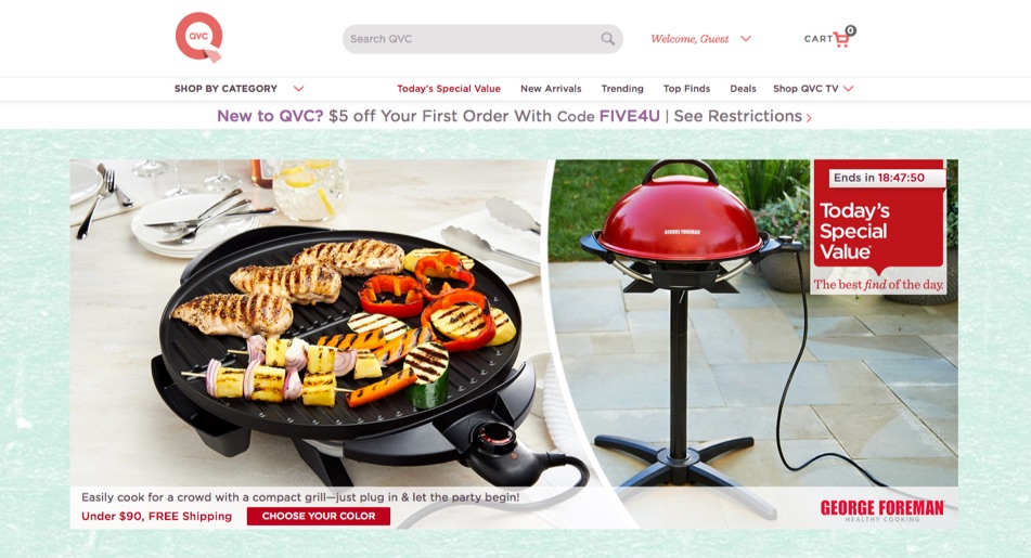
There’s a few things happening here.
Right at the top, “New to QVC?” helps segment and orient first-time visitors. They also throw in a discount code to sweeten the deal right off the bat.
Next, those high-quality images that show the product in-use. Underneath, is a simple line of benefit-laden copy with a price anchor (“Under $90”) and free shipping incentive (which almost all consumers – 82% – want).
To the right, is a bright-red CTA that uses the next value-building step (“Choose Your Color”) instead of some vague, generic one you might see on other sites (like “Get Started” or “Buy Now”).
And last but not least, that giant daily deal “Today’s Special Value” with countdown timer.
So far so good. They’ve set the stage. Met first impressions successfully, which only take 50 milliseconds to form based on site design (94% of the time).
But that’s nothing. We’re barely scratching the surface.
There’s a concept called “conversion scent” in advertising and conversion optimization. It’s similar to ‘message match’. Basically, you want to make sure any copy, design, or page elements (like that big, bold countdown timer) follow someone to the ‘next step’ so there’s one seamless experience (and not a jarring, disrupted one that distracts people from converting).
For example, click on the featured homepage product (noting the countdown timer) and watch what happens next…
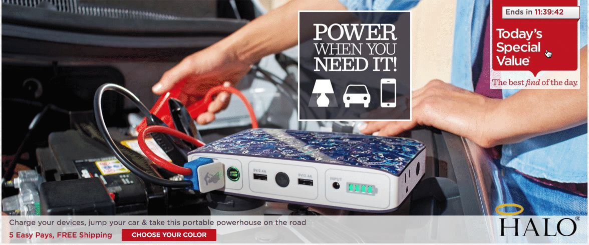
You’re brought to the individual product page that continues the timer where you left off, while also auto-starting a realistic, authentic video demonstration.
That’s heavy. Let’s save it for the next section below to unpack everything that’s happening (and why). We still gotta finish the homepage.
When you scroll down a little on the homepage, one of the next sections is their “Lunchtime Specials” one that has daily deals that run for only a few hours each day.
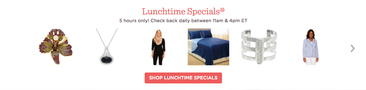
Selling online is tough. Average conversions are an abysmal ~2%. Partly because there’s no ‘human element’ (phone sales get an average of 30-50% conversion for comparison). And partly because there’s no urgency.
In most cases, people don’t need what you have. It’s a luxury. A take-it-or-leave-it kinda thing.
You manufacture urgency with scarcity; Cialdini’s bedrock principle. If something is limited (by either price or quantity), it’s more desirable. I dunno why. Evolution is weird.
Below the scarcity-induced Lunchtime Specials section, you get “On QVC Now”.
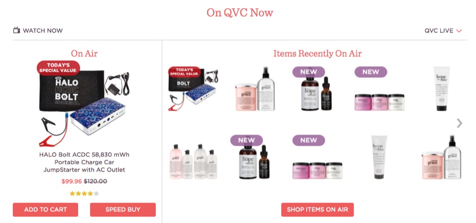
Two macro-things happening with this section.
First, the fact that they’re being presented on television automatically enhances their value and credibility. There’s prestige. It implies these are the ‘chosen few’ being ‘featured’. It’s no different (well, it’s better) than startups putting media logos on their site.
Second, are power words like “Now” and “New” (with extra credit for “On Air”). Power words speak to our ‘old brain’ ultimately controls what we do, decide (or buy).
“New”, in particular, is one of the most persuasive words you can use to grab attention. Power words leap off the page, tickle your primal instincts, and force you to find out more.
Now… (see that?!)
Let’s head back into the individual product page to do a deep-drive on the eleven different elements they use (all above the fold!) to sell the S– out of their products.
#2. Individual Product Page
You might want to grab a cup of coffee before starting this next section. It’s gonna be awhile.
Because here’s where the QVC really outdo themselves.
Let me count the ways.
No seriously. Let’s count them. (And keep in mind that these are almost entirely above the fold.)
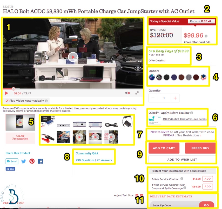
Deep breath. And:
- Autoplay Video: Immediately starts upon page load. Continues that product ‘scent’ discussed earlier, while showing the product in context so 4 out of 5 shoppers can get a feel of what it is, how it works, and what if will feel like to own one.
- Countdown Timer: Already discussed. The ultimate in scarcity-boosting, slightly ‘spammy’ website techniques to manufacture customer urgency. But just below that, a beautiful example of price anchoring, making the ‘real’ price now seem cheap and affordable.
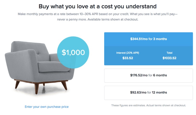
- Payment Installments: Friction typically reduces conversions. A large, one-time fee is a big friction point, forcing the customer to assume all risk. But with installment payments, you’re able to make that lump sum more palatable and digestible for those on a budget. We’ll come back to this topic in the next section below.
- Color Options: Even something as basic as multiple color options can introduce the feeling of personalization on a website. 75% of people like personalization, which means it should be unsurprising that almost the same amount (74%) dislike when a website doesn’t match up or cater to their interests.
- MOAR VIDEOS: Honestly, we shouldn’t even have to touch on the importance of including more videos, seeing as they boost landing page conversions by 80%. Even executives – theoretically the most cold-hearted of consumers – get all warm and fuzzy when they can watch a product video.
- QCard: No money? No problem! QVC has their own financing department, and they’ll happily underwrite your purchase. Once again, less friction = more conversions.
- New Customer Incentive: New shoppers get a little added bonus (on top of all the other discounts and price slashing going on) to go ahead and take the leap.
- Community Q&A: The importance of social commerce deserves an entire post of its own. Suffice to say, peer-to-peer recommendations are what drive product purchases today. You can use all the hyperbole you want on a page, but customers will look for reviews. Plain and simple. Here, this QVC product has 411 answers!
- Speed Buy: Sure, the Add to Cart and Wishlist buttons are standard. But the Speed Buy is where it’s at. This is the QVC’s version of Amazon’s One Click to Buy. Why’s that important? Because that little damn button is patented and worth billions (with a “B”). That’s why.
- Upsells: No easier way to drive up the average cost of each order than with a simple upsell offer to insure your brand new purchase. Best of all, it’s not like the QVC has to do anything extra if you choose this upsell. A partner takes care of the dirty work. They just get to collect some extra revenue on each little purchase that passes through their kingdom. Upselling a current product can be 20 times more effective than cross-selling (a similar but different product).
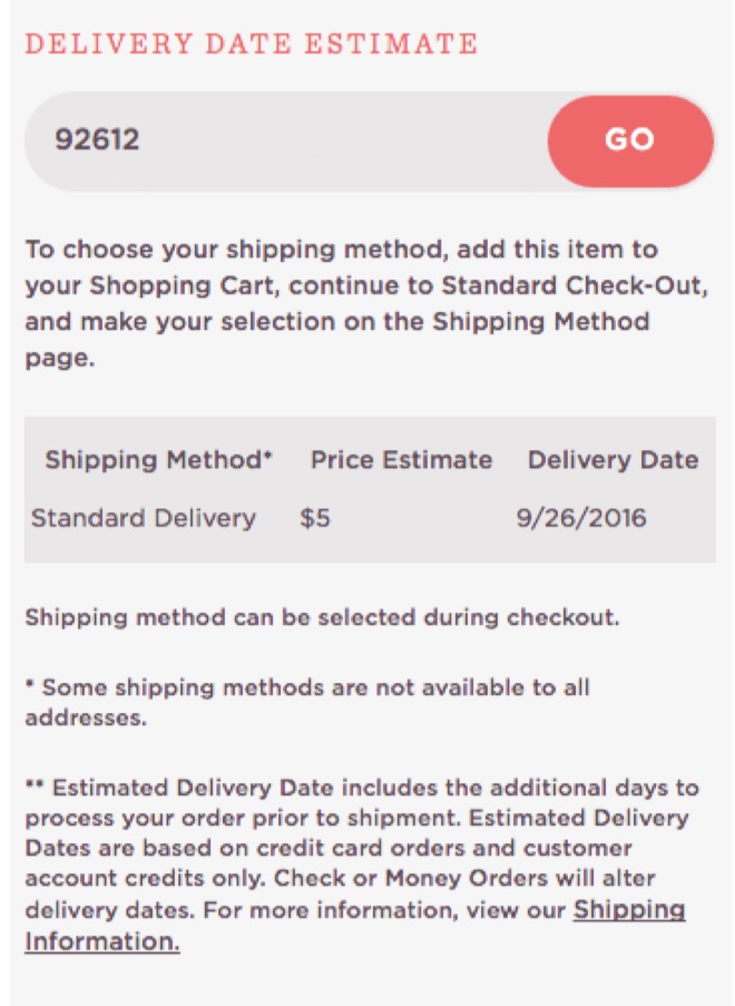
- Delivery Date Estimate: The best saved for last. You punch in your zip code and they’ll give you an idea of how shipping will work, and how fast you’ll get it. Here’s why that’s important…
We’ve seen multiple times how the QVC is attempting to reduce friction to increase your impulse to purchase (and we’ll continue to beat that horse dead in the section below).
But that’s only half the battle.
At the end of the day, the big hurdle to an online purchase is instant gratification. Or lack thereof. There’s gonna be a delay of when that thing they just spent good money on lands in their hands (or on their doorstep).
So reducing friction is good. But it’s not enough. Andre Morys says we need to raise motivation, too.
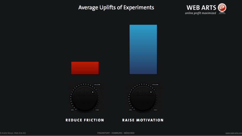
That’s what this Delivery Date Estimate does. It helps us see a real, live date for when we’ll get access to the new product.
#3. Risk Reversing Payment Options
Number seven in the last section previewed the QCard, QVC’s financing arm to extend credit for their purchases.
Here’s the full details:
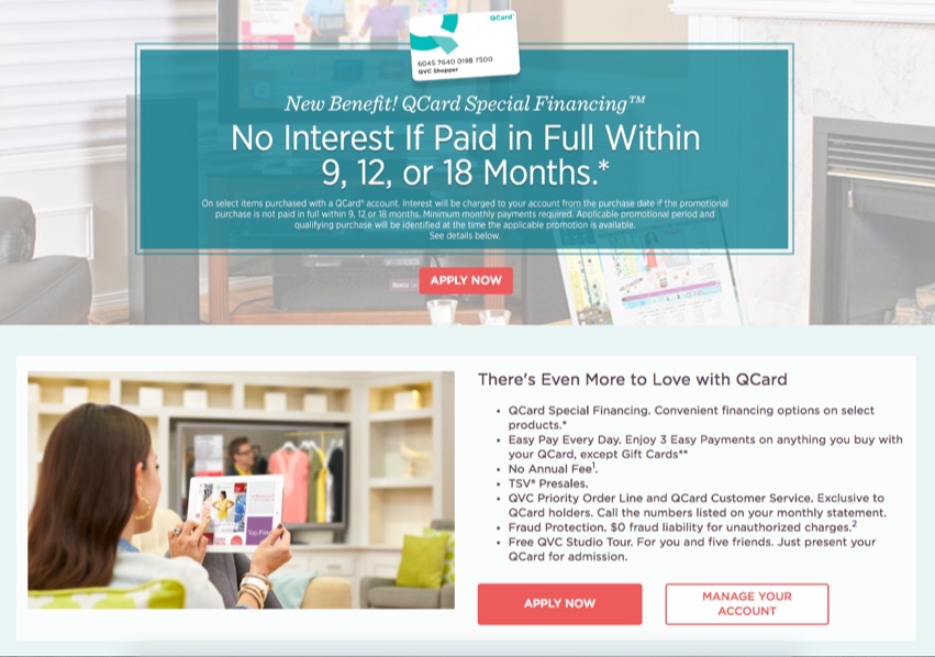
Select products enjoy little-to-no interest payments, which lowers the bar (or barrier) to purchase).
Then that bar is lowered even with further with installment payments on the QCard (which you typically wouldn’t with other credit cards).
Why is this noteworthy?
Because one of the rising trends in eCommerce right now is “buy-now, pay-later solutions”
New upstarts like Affirm are essentially extending credit for eCommerce companies for big-ticket items which they may not be able to already afford.
We can sit here and poke fun at QVC’s customer segment all we want. But the fact is that they expertly recognize their customer’s problems and pain points, along with what hold them back from purchasing (like low fixed incomes).
And they’re doing things to bypass or lessen that burden.
On top of the infomercial-like installment payment options, they also provide a few different ways to return products.
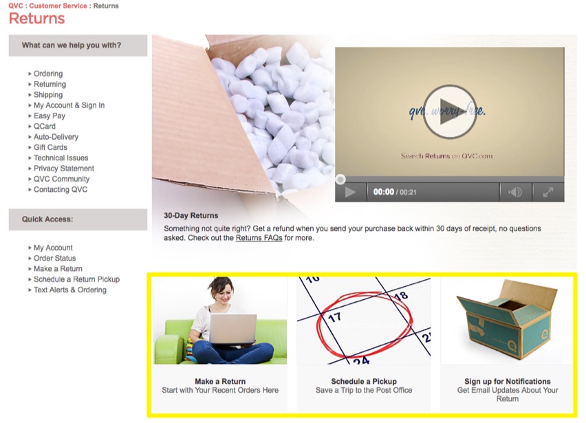
They’re trying to make the process insanely easy. So they employ as many risk-reversing techniques imaginable. Customers can schedule a pickup so that they don’t have to leave their house! Even if the QVC loses a few purchases or returns in the process.
Conclusion
A few months ago I was at a dinner with several other marketers. Some of them worked with tech companies on subscription based products.
A conversation started about tips for reducing churn, and a few examples were given about how you can easily reduce churn by essentially making it a pain in the ass to cancel. Like a huge headache. Forcing customers to literally jump through hoops, taking several different steps, having to talk to people on the phone, even mail-in stuff.
And this out of body experience hit me:
“WTF are we doing?”
Purposefully making people’s lives harder? Just to shave a half-percent off your churn rate?
Topics like this are tough because it opens up a can of worms. So many unintended consequences.
QVC ain’t perfect. But they’ve been around for 30+ years. They’re a household name.
They use all of the classic hard-sell website techniques imaginable. But then they’ll give customers multiple different ways to easily return products (which costs them millions I bet).
Keep sight of what we’re doing and why. The end goal is a multi-million dollar brand that people love. Not a half percent higher conversion rate or half percent lower churn rate.
About the Author: Brad Smith is a marketing writer, agency partner, and creator of Copy Weekly, a free weekly copywriting newsletter for marketers & founders.
No comments:
Post a Comment