It’s a given that images can help lift conversions, but there’s more to it — literally — than meets the eye. Subtle image edits can make a big difference in audience reactions and, ultimately, in conversions.
Numerous eye-tracking studies have been done using heat maps, saccade pathways and other methods. These studies reveal that web visitors tend to view content in three distinct patterns:
- Z pattern: As you would suspect, the eye starts at the top-left of the page in a Z formation until it reaches the bottom-right.
- F pattern: Again, the eye starts at the top left and moves across the page to the right, then moves down a little and repeats the movement.
- Gutenberg diagram: You guessed it. This pattern also starts at the top left but moves in a straight diagonal to the bottom right, more or less ignoring the other corners.
You can help guide site visitors to the desired content and, in turn, desired actions by manipulating your images. I’m not suggesting you distort your images, but you should keep in mind the various elements outlined below when placing images on your website and in your emails and online ads.
Image Direction
A basic concept in graphic design is that the reader’s eye will tend to follow the direction of an image. This goes back to my days as a layout editor at a daily newspaper. If we wanted the reader to turn the page, we used a right-facing image. If we wanted the reader to read a headline/article to the left of the image, we used a left-facing image. It’s not rocket science, but it works.
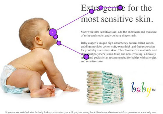
Here, the right-facing image is a compelling one, drawing the eye to the headline:
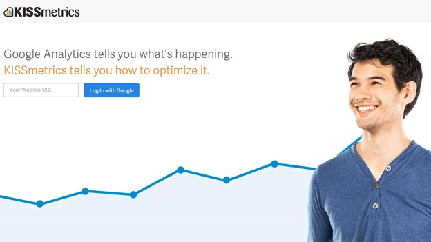
And in the example below, a left-facing image achieves the same result. You’ve probably found yourself following the eyes, which point to the headline and the single form on the page.
This same principle applies to web design as well. If your image does not face in the desired direction, you can either adjust your layout or the image itself. However, flopping an image can be risky; you must check to ensure that it does not distort the content, such as showing lettering backward.
Eye Direction
The internet is one-to-one communication, so when a site visitor sees an image of a face, the reaction is often an emotional one. Science corroborates this: The fusiform face area (FFA) is a part of the brain, near the brain’s emotional center, that exclusively identifies faces. This explains why, when you see a face, you experience an emotional response.
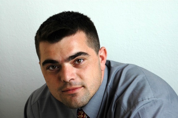
In the photo below, the man is looking straight at the camera (and straight at you). You likely noticed that your eyes naturally gravitated towards his (even the scrollers out there). Now, just try to look away.
A study by the University of Aberdeen Face Research Lab showed participants two photos of a person, one looking directly at the camera and one looking away. The person in the forward-facing photo was perceived as being more likable, attractive and trustworthy.
A recent ConversionXL study found that a person looking away from a form resulted in the shortest visitor time spent looking at the form.
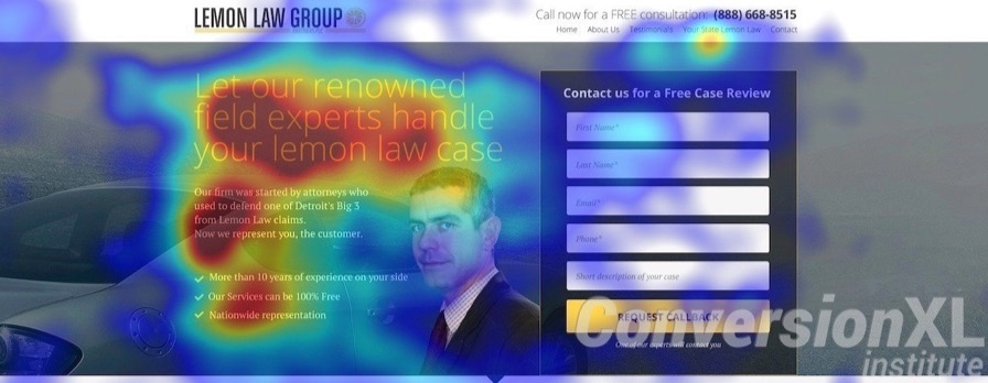
But it can also work with arrows. Point an arrow to a form and you’ll get more people to view the form:

People looking right at the visitor (or viewer) can also be attention-grabbing. Remember Apple’s Mac vs PC ads?
These ads caught attention and held the attention because the commercial spoke to the viewer, and the actors were looking right back at the viewer. Most television ads usually have people not looking at the camera, which is why these ads were so effective – it was a changeup and spoke directly to the viewer.
Special Effects
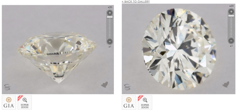
The product or service you are promoting also can have an impact on the images you use. Let’s say you’re selling diamond jewelry. An ecommerce site must mimic the experience a customer would have in a brick-and-mortar store. That’s why New York-based jeweler James Allen utilizes 360˚ views:
Better yet, on a website you’ve got the advantage of using video. Sleeknote uses their homepage to demo their product (making it difficult to not understand what they do if you watch at least 5 seconds):
Conclusion
There’s always room for improvement when working to increase conversions. While your goal is to engage new prospects, you still want to keep your current customers engaged. Regularly change up images and content on your site. Use site analytics to determine how often your site attracts repeat visits, and use that as a gauge to determine how often to update content.
Remember, you’ve got only a matter of seconds to engage a visitor to your website. Visual elements are extremely important, and if you’re relying on stock photography you’d be wise to implement some of the techniques discussed here. This can take a photo from ordinary to extraordinary and, in the end, help lift conversions.
About the Author: Darcy Grabenstein is a freelance copywriter specializing in email marketing and public relations.
No comments:
Post a Comment