Websites don’t always work.
You create them with one thing in mind. And then the opposite happens.
People are supposed to click-through. And yet they stall.
The worst part, is that you don’t always know why.
It’s hard to explain to bosses. It’s difficult to justify to clients.
Thankfully, there are a few techniques to look ‘under the hood.’ To voyeuristically view viewers when they least expect it.
In order to figure out what’s broken, why, and how to fix it.
Here’s how you can find out, and then use ‘visual clues’ to help improve it.
Why People Shouldn’t Have to ‘Think’ When on Your Website
50 milliseconds.
That’s all it takes. That’s as long as you’ve got.
The human brain registers what the eyes are seeing within 13 milliseconds. And by 50 they’ve already formed a first impression.
The overwhelming majority of the time – 94% according to one study – first impressions come down to your design.
If it’s good (or not). If it’s easy to navigate (or not). And if it’s easy to find what they’re looking for. Or not.
That’s not a very long window of time. 50 milliseconds is like… fractions of a second, dude! So you’re up against it from the beginning. The odds are stacked against you.
That’s why, in a nutshell, making people think is bad. Simply put: there’s not enough processing time. By that point, the subconscious has already taken over and forced them to click the Back button on their browser.
It makes sense, then, that some of the best UX and conversion principles are contained in a brilliant little book called Don’t Make Me Think.
It’s chock full of brilliant little nuggets of wisdom. Practical, actionable stuff that can make an immediate impact.
Like naming conventions. You know how egotistical ‘professional’ consultants try to get all clever with their website navigation text? Things like: “Our Insights” instead of just “Blog”.
Turns out, not everyone’s privy to your insightfulness. So dropping insight bombs on the primary nav goes undetected. Unnoticed. And therefore, unclicked.
That’s a problem. Because if no one checks out your blog, they won’t see how smart you are. They won’t share those blog posts. So they won’t be indexed. Which means fewer people still will find them. Which translates into fewer leads generated or sales closed.
For example, take a look at this image.

First pass it looks fine, right? The reason it looks like someone dimmed the lights is because there’s a heatmap analysis over the web page.
But… don’t heatmaps typically show little ‘hot’ areas on the page where the majority of people are clicking?
Why yes! Yes, they do! And therein lies the problem. There ain’t no hotspots on this image!
That page is for a portfolio section. You know, the page on your site which shows off your past work so that new people like it and reach out to you.
However, if no one is clicking and viewing those pages, no one’s going to be blowing up your email inbox about new services, either.
So that’s where we begin. Accepting our current deficiencies. And setting out to find a solution. Here goes.
Step #1. Start by Identifying What’s NOT Happening (that Should Be)
The previous example is a good place to start. It’s incredibly important. And yet something’s missing.
Specifically, people aren’t clicking on it. So that’s the first step: figure out what’s not happening (but should be) with basic user behavior tools.
Option #1. is something simple and straightforward like CrazyEgg. No frills. Not many bells and whistles. But it gets the job done (as we’ll see in the next section). It’s got your basic heatmaps, scrollmaps, and a few advanced features to see how unique traffic segments interact with pages differently.
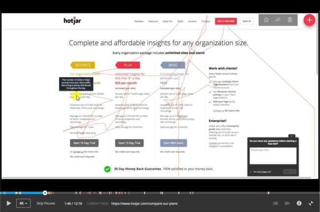
HotJar helps you record website behavior as it’s happening. So you can do a lot of the same, basic heat mapping analysis. But instead of viewing data in aggregate, you can zoom in to see what’s happening within an individual session.
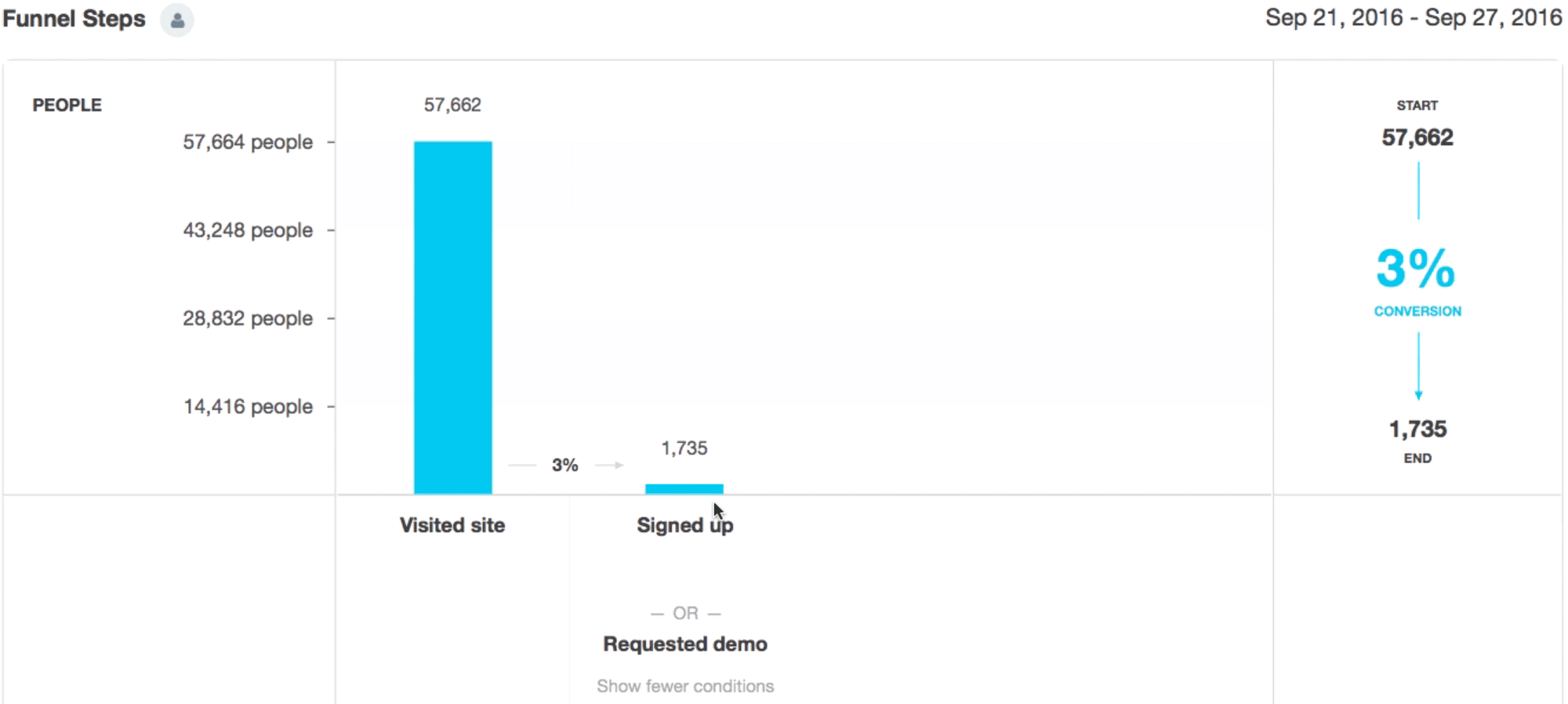
Kissmetrics’ Funnel Report lets you see where those ‘conversion roadblocks’ are popping up; preventing people from taking that ‘next step’ required to put money in your pocket.
Last but not least there’s UserTesting. Thankfully another literal brand name that helps you find users to test your website, checkout flow, or app. It even lets you pre-screen people. So the only ones allowed to take your test meet a number of criteria (like men between the ages of 18 – 32 who own an iPhone and graduated from college).
The point? There’s no shortage of tools that will give you feedback on what’s working, and what’s not. Hell – even the free version of Sumo will hook you up with some of these basic features.
Once you’ve got them locked and loaded, take a look to see what’s not happening. The action that you want people to take, but for whatever reason, they aren’t.
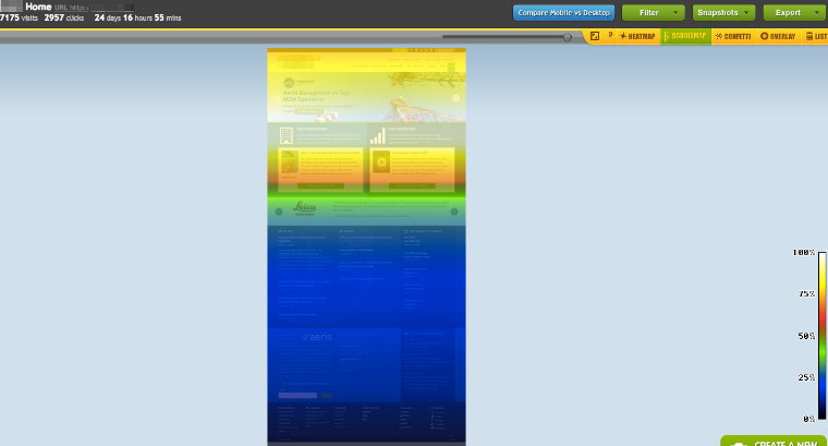
For example, a landing page scrollmap should look something like this:
Lots of yellows, oranges, and reds. Lots of heat coming off that thing. It means people are scrolling the entire way down. They’re consuming the information on that page. And they’re sticking around long enough to hit the bottom.
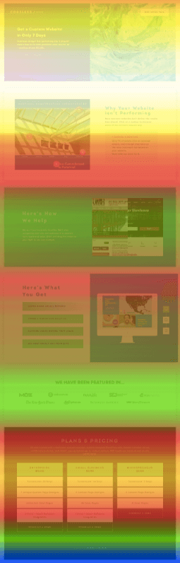
Now contrast that with this one:
More than half the page resembles the deep, dark, blue, murky waters of the Pacific. And similar to those uncharted depths, nobody goes to the bottom of this page, either.
Start there. And then start brainstorming.
Step #2. Hypothesize Why People Aren’t Doing What They’re Supposed to Be Doing
Ok. Back to the first example.
A portfolio section on a website. Looks like a ghost town because no one’s checking out the past work.
Yup. That’s the one.
People are supposed to be clicking on those two images. They’re supposed to be checking out the work. But they’re not.
Here’s a similarly bad example of clicks happening almost every single other place on this Services page, except where they should be happening.
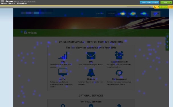
Ok. Let’s brainstorm.
The first example kinda just looks like stock photos. Good ones. But stock photos nonetheless. It’s not very obvious that people should be clicking in the first place.
And the second? There’s maybe too much stuff. There’s little icons and text all over the place. There’s also no ‘hierarchy’ of information. So people don’t know where to focus or click first.
The table-like design isn’t working. It’s not getting people to click on what they’re supposed to be clicking.
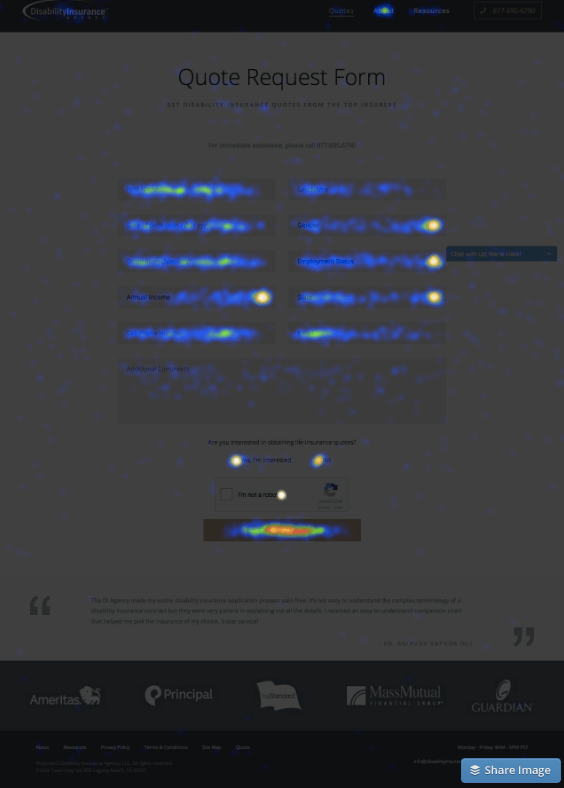
Now let’s compare that with a good example.
A landing page that’s simple in layout, but focused on getting people to interact with one thing and one thing only.

Perfect. The primary button is all lit up.
‘Click distribution’ should back this up. The page elements with the highest percentage of interactions (or clicks) should be those one or two (tops) page features. For example, a button that brings you to a form. Or a link that brings you to another page that’s one step deeper in your online sales funnel.
Each page then should slowly lead visitors from one step to the next. The previous example brings people to this next page. And the same pattern should repeat: the majority of user behavior is happening on exactly the stuff you want it to.
Ok, cool.
But what if that’s not happening? How do you correct course before it’s too late?
Step #3. Now Use ‘Visual Cues’ to Tell People What they Should be Doing
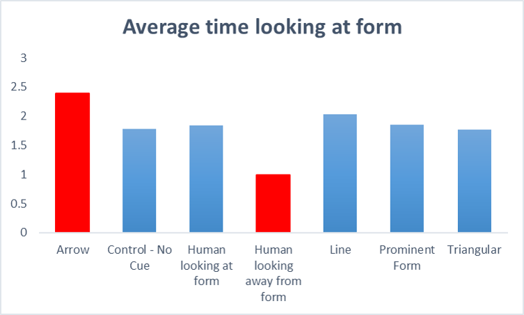
‘Visual cues’ are exactly what they sound like. They’re design elements used to direct a viewer’s eyeline. To direct their attention to something specific.
They can be overt, like a big arrow. Or they can be subtle. They can be intentional. Or unintentional mistakes that distract users.
For example, a ConversionXL study found that a person looking away from a form resulted in the shortest visitor time spent looking at the form, too. Instead, they’re looking at the person. They’re looking at what they person’s looking at.
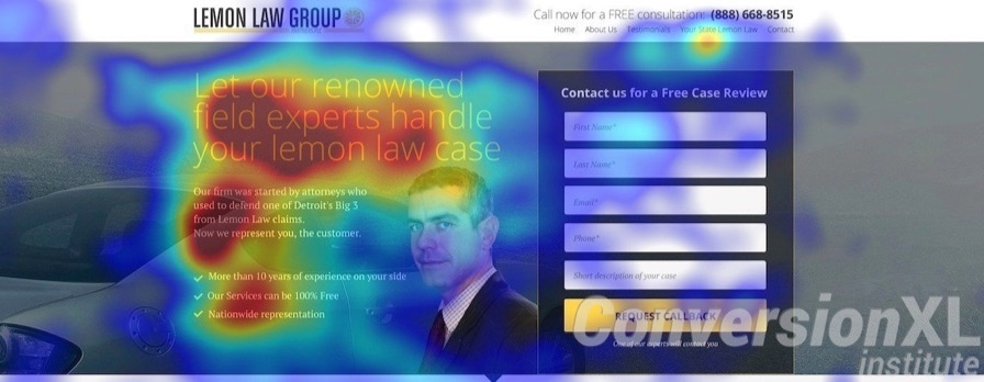
The opposite also proved to be true. For example, an arrow pointing towards a page form resulted in the longest viewer time spent looking at the form.

They even took this one step further, testing which specific visual cues on a page resulted in the longest time spent looking at the primary page CTA (the form).
That’s what good design does.
Not win pointless ADDY’s or just look amazing. But spell out how a page should work or function.
‘Visual hierarchies’ are one example. That’s like using a primary H1 Headline on a page, with a subhead underneath, and a smaller button underneath that.
You’re calling people’s attention, through size and page placement, to elements one (headline), two (subhead), and three (the button).
This next oft-repeated example suffers from two primary problems:
- No visual hierarchy
- Page elements don’t look ‘clickable’
That’s one of the biggest problems with flat design. When things are too flat, it doesn’t properly communicate to a viewer what it is (or what they’re supposed to do with it).
HubSpot uses a flat design for it’s Website Grader. But they expertly avoid running into this problem by stretching out the underlined form element and then placing a blinking cursor where you’re supposed to type your website address and email.
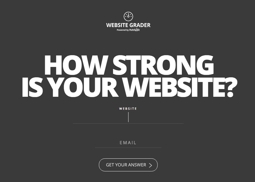
It’s subtle. But it works.
Most of your website visitors like to scan. And they also most likely have several browser tabs open. So they’re distracted. Scanning helps them quickly digest information.
That means your page design needs to be conducive to scanning. Like this previous example:
It’s a long page. But there’s a clear visual hierarchy that’s then split up into different sections. Viewers can easily jump from one section to the next.
Zooming into an individual section, there’s also visual cues on the far right – little device icons – to get people to interact and discover how this service changes on each device.
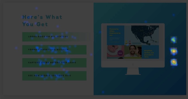
The end result is that people are doing what they’re supposed to be doing. They’re diving deeper into the information on this page. And they’re discovering how the benefits of this service. (Which will hopefully lead more, happy, informed visitors to become leads and customers.)
Conclusion
Website are never ‘done.’
The deployment isn’t the finish line. But a starting point.
Inevitably, unfortunately, it’s not going to work as intended.
There’s going to be a few pages, or a few transitions, that frustrate visitors to the point of bouncing.
The good news is that you can choose from a variety of user behavior tools to help. Once installed, you’ll be able to analyze what people aren’t doing. And hypothesize why they’re not doing it.
Then you can iterate. Using simple ‘visual cues’ that help people immediately understand what they should be doing on each page.
Without requiring even the slightest mental energy expended.
About the Author: Brad Smith is the founder of Codeless, a B2B content creation company. Frequent contributor to Kissmetrics, Unbounce, WordStream, AdEspresso, Search Engine Journal, Autopilot, and more.
No comments:
Post a Comment