Posted by R0bin_L0rd
What is Unbounce?
Unbounce is a well-known and well-regarded landing page creation tool designed to allow HTML novices to create impressive and impactful landing pages, while offering scope for more experienced coders to have a bit more fun.
In this post, I’m going to list some solutions to what I refer to as the “one form” problem of Unbounce, their strengths and weaknesses, and which I personally prefer.
What is the "one form" problem?
As with any system that tries to take complex processes and make them simple to implement, there’s a certain amount of nuance and flexibility that has to be sacrificed.
One limitation is that each landing page on Unbounce can only have one embedded form (there are a few community articles discussing the topic, for instance: 1, 2, 3). While there’s a definite risk of call-to-action fatigue if you bombard your visitors with forms, it’s a reasonable requirement to want to provide easy access to your form at more than one point.
For example, you could lead with a strong call to action and the form at the top of the page, then follow up further down the page when users have had time to absorb more information about your offering. A simple example of this is the below Teambit landing page, which was featured in Hubspot’s 16 of the Best Landing Page Design Examples You Need to See in 2017.

The top of this Teambit page features a simple email collection form

The form is repeated at the bottom of the page once visitors have had a chance to read more.
Potential solutions to the one-form issue
Now that we’ve established the problem, let’s run through some solutions, shall we?
Fortunately, there are a few possible ways to solve this problem, either using built-in Unbounce tools or by adding code through open HTML, CSS, and JavaScript inputs.
It’s worth bearing in mind that one solution is to not have the form on your page at all, and have your call-to-action buttons linking to other pages with forms. This is the approach Unbounce uses in the example below. While that’s a perfectly valid approach, I wouldn’t call it so much a solution to this problem as a completely different format, so I haven’t included it in the list below.

Here Unbounce use two CTAs (the orange buttons), but don’t rely on having the form on the page.
1. Scrolling anchor button
This is potentially the simplest solution, as it’s natively supported by Unbounce:
- Create a button further down the page where you would want your second form.
- Edit that button, in the “Click Action” section of the right-hand button settings panel, where you would normally put the URL you are linking to
- Add in the unique ID code for the box that holds your form (you can find that by editing the box and scrolling to the bottom of the right-hand panel to "Element Metadata")

Register button

“Click Action” section of right-hand button settings panel

“Element Metadata” section at bottom of right-hand element setting panel
Benefits
Quick and easy to implement, little direct JavaScript or HTML manipulation needed.
Drawbacks
There are far more seamless ways to achieve this from the user perspective. Even with smooth scrolling (see “bonus points” below), the experience can be a little jarring for users, particularly if they want to go back to check information elsewhere on a page.
Bonus points
Just adding that in as-is will mean a pretty jarring experience for users. When they click the button, the page will jump back to your form as though it’s loaded a new page. To help visitors understand what’s going on, add smooth scrolling through JavaScript. Unbounce has how-to information here.
Double bonus
The link anchors work by aligning the top of your screen with the top of the thing you’ve anchored. That can leave it looking like you’ve undershot a bit, because the form is almost falling off the screen. You can solve this simply by putting a tiny, one-pixel-wide box a little bit above the form, with no fill or border, positioning it how you want, and linking to the ID of that box instead, allowing a bit of breathing room above your form.

Without and with the one-pixel-wide box for headroom
2. iFrames
Unbounce allows free <HTML> blocks, which you can use to embed a form from another service or even another Unbounce page that consists of only a form. You’ll need to drag the “Custom HTML” block from the left bar to where you want the form to be and paste in your iFrame code.

The “Custom HTML” block in the left-hand bar

Blank HTML box that pops up

How HTML blocks look in the editor
Benefits
This will allow for multiple forms, for each form to be positioned differently on the page, to function in a different way, and for entries to each form to be tagged differently (which will offer insight on the effectiveness of the page).
This solution will also allow you to make the most of functionality from other services, such as Wufoo (Unbounce has documented the process for that here).
Drawbacks
Having chosen Unbounce as a one-stop-shop for creating landing pages, breaking out of that to use external forms could be considered a step away from the original purpose. This also introduces complications in construction, because you can’t see how the form will look on the page in the editing mode. So your workflow for changes could look like:
- Change external form
- Review page and see styling issues
- Change layout in Unbounce editor
- Review page and see that the external form isn’t as readable
- Change external form
- Etc.
Bonus points
Unbounce can’t track conversions through an iFrame, so even if you use another Unbounce page as the form you draw in, you’re going to be breaking out of Unbounce’s native tracking. They have a script here you can use to fire external tracking hits to track page success more centrally so you get more of a feel for whether individual pages are performing well.
Double bonus
Even if you’re using an identical Unbounce page to pull through the same form functionality twice, tag the form completions differently to give you an idea of whether users are more likely to convert at the top of the page before they get distracted, or lower down when they have had time to absorb the benefits of your offering.
3. Sticky form (always there)
An option that will keep everything on the same page is a sticky form. You can use CSS styling to fix it in place on a screen rather than on a page, then when your visitor scrolls down, the form or CTA will travel with them — always within easy reach.
This simple CSS code will fix a form on the right-hand side of a page for screen widths over 800px (that being where Unbounce switches from Desktop to Mobile design, meaning the positioning needs to be different).
Each ID element below corresponds to a different box which I wanted to move together. You’ll need to change the “lp-pom-box-xxx” below to match the IDs of what you want to move down the page with the user (you can find those IDs in the “Element Metadata” section as described in the Scrolling Anchor Button solution above).
<style>
@media (min-width: 800px) {
    #lp-pom-box-56{ position:fixed; left:50%; margin-left: 123px; top:25%; margin-top:-70px}
    #lp-pom-form-59{ position:fixed; left:50%; margin-left: 141px; top:25%; margin-top:60px}
    #lp-pom-box-54{ position:fixed; left:50%; margin-left: 123px; top:25%; margin-top:50px}}
</style>

Benefits
This allows you to keep tracking within Unbounce. It cuts out a lot of the back and forth of building the form elsewhere and then trying to make that form, within an iFrame, act on your page the way you want it to.
Drawbacks
The problem with this is that users can quickly become blind to a CTA that travels with them, adding some kind of regular attention seeking effect is likely to just annoy them. The solution here is to have your call to action or form obscured during parts of the page, only to reappear at other, more appropriate times (as in the next section).
It can be difficult to see exactly where the form will appear because your CSS changes won’t take effect in the editor preview, but you will be able to see the impact when you save and preview the page.
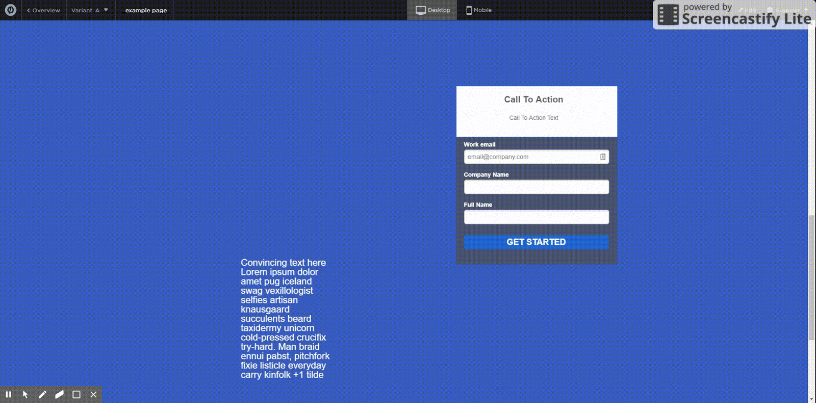
4. Sticky form (appearing and disappearing)
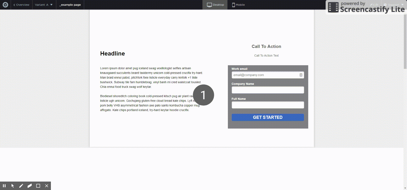
The simplest way to achieve this is using z-index. In short, the z-index is a way of communicating layers through HTML, an image with a z-index of 2 will be interpreted as closer to the user than a box with a z-index of 1, so when viewing the page it’ll look like the image is in front of the box.
For this method, you’ll need some kind of opaque box in each section of your page. The box can be filled with a color, image, gradient — it doesn’t matter as long as it isn’t transparent. After you’ve put the boxes in place, make a note of their z-index, which you can find in the “Meta Data” section of the right-hand settings bar, the same place that the Element ID is shown.

This box has a z-index of 31, so it’ll cover something with an index of 30
Then use CSS to select the elements you’re moving down the page and set their z-index to a lower number. In the below lines I’ve selected two elements and set their z-index to 30, which means that they’ll be hidden behind the box above, which has a z-index of 31. Again, here you’ll want to replace the IDs that start #lp-pom-box-xxxx with the same IDs you used in the Sticky Form (Always There) solution above.
<style>
    #lp-pom-box-133{z-index: 30; }
    #lp-pom-box-135{z-index: 30; }
</style>
When you're choosing the place where you want your form to be visible again, just remove any items that might obscure the form during that section. It’ll scroll into view.
Benefits
This will allow you to offer a full form for users to fill out, at different points on the page, without having to worry about it becoming wallpaper or whether you can marry up external conversions. Using only CSS will also mean that you don’t have to worry about users with JavaScript turned off (while the bonus points below rely on JavaScript, this will fall back gracefully if JavaScript is turned off).
Drawbacks
Unlike the iFrame method, this won’t allow you to use more than one form format. It also requires a bit more CSS knowledge (and the bonus points will require at least a bit of trial and error with JavaScript).
Bonus points
Use JavaScript to apply and remove CSS classes based on your scrolling position on the page. For example you can create CSS classes like these which make elements fade in and out of view.
CSS:
<style>
@media (min-width: 800px) {
   /* make the opacity of an element 0 where it has this class */
       .hide {
       opacity: 0;
}
   /* instead of applying an effect immediately, apply it gradually over 0.2 seconds */    .transition {
   -webkit-transition: all 0.2s ease-in-out;
       -moz-transition: all 0.2s ease-in-out;
       -o-transition: all 0.2s ease-in-out;
       transition: all 0.2s ease-in-out;
    }}
</style>
You could then use this JavaScript to apply the .hide class when user scrolls through certain points, and remove it when they get to the points where you want them to see the form. This can be used for finer-grained control of where the form appears, without having to just cover it up. As before, you’ll need to update the #lp-pom-box-xxx strings to match the IDs in your account.
JavaScript:
<script>
// This script applies the “hide” class, which makes opacity zero, to certain elements when we scroll more than 100 pixels away from the top of the page. Effectively, if we scroll down the page these items will fade away.
$(window).scroll(function() {
    if ($(window).scrollTop() > 100 ){
        $('#lp-pom-box-54').addClass('hide');
        $('#lp-pom-box-228').addClass('hide');
}
// This section removes the hide class if we’re less than 500 pixels from the bottom of the page or scroll back up to be less than 100 from the top. This means that those elements will fade back into view when we’re near the bottom of the page or go back to the top.
if ($(document).height() - ($(window).height() + $(window).scrollTop()) < 500 ||
$(window).scrollTop() < 100 ){
    $('#lp-pom-box-54').removeClass('hide');
    $('#lp-pom-box-228').removeClass('hide');
}}
</script>
Double bonusYou could consider using JavaScript to selectively hide or show form fields at different points. That would allow you to show a longer form initially, for example, and a shorter form when it appears the second time, despite it actually being the same form each time.
For this, you’d just add to your .scroll JavaScript function above:
   if ($(document).height() - ($(window).height() + $(window).scrollTop()) < 75){
// This part hides the “full name” part of the form, moves the submit button up and reduces the size of the box when we scroll down to less than 75 pixels away from the bottom of the page
    $('#container_full_name').addClass('hide');
    $('#lp-pom-box-54').stop().animate({height: "200px"},200);
    $('.lp-pom-button-60-unmoved').animate({top: '-=75'}, 200);
    $('#lp-pom-button-60').removeClass('lp-pom-button-60-unmoved');
    $('#lp-pom-button-60').addClass('lp-pom-button-60-moved');}
    else{
// This part adds the “full name” part back in to the form, moves the submit button back down and increases the size of the box if we scroll back up.
    $('#container_full_name').removeClass('hide');
    $('#lp-pom-box-54').stop().animate({height: "300px"},200);
    $('.lp-pom-button-60-moved').animate({top: '+=75'}, 200);
    $('#lp-pom-button-60').removeClass('lp-pom-button-60-moved');
    $('#lp-pom-button-60').addClass('lp-pom-button-60-unmoved');
When scrolling within 75px of the bottom of the page, our JavaScript hides the Full Name field, reduces the size of the box, and moves the button up. This could all happen when the form is hidden from view; I’ve just done it in view to demonstrate.
Conclusion
In the table below I’ve pulled together a quick list of the different solutions and their strengths and weaknesses.
|
Solution |
Strengths |
Weaknesses |
|---|---|---|
|
Scrolling anchor button |
Easy implementation, little coding needed |
Jarring user experience |
|
iFrame |
Multiple different forms |
Requires building the form elsewhere and introduces some styling and analytics complexity to workflow |
|
Sticky form (always there) |
Keeps and design tracking within one Unbounce project |
CTA fatigue, using up a lot of page space |
|
Sticky form (appearing and disappearing) |
The benefits of a sticky form, plus avoiding the CTA fatigue and large space requirement |
CSS knowledge required, can only use one form |
Personally, my favorite has been the Sticky Form (appearing and disappearing) option, to reduce the need to integrate external tools, but if I had to use multiple different forms I could definitely imagine using an iFrame.
Which is your favorite? Have I missed any cool solutions? Feel free to ping me in the comments.
Sign up for The Moz Top 10, a semimonthly mailer updating you on the top ten hottest pieces of SEO news, tips, and rad links uncovered by the Moz team. Think of it as your exclusive digest of stuff you don't have time to hunt down but want to read!
https://www.welookups.com/cssref/pr_pos_z-index.html
ReplyDelete