 Call To Action (CTA) buttons are kind of like the marriage proposal: the success or failure of everything you do (or don't do) leading up to that point hinges on the critical moment when the answer is either "yes" or "no". All of the online and inbound marketing done with the careful help of your digital marketing agency, the SEO, content development, ad placement -- it all comes down to whether or not the visitor to your landing page clicks that button and converts. Did you do it all right?
Fortunately, the psychology of the CTA click is a bit better understood than the marriage proposal. Unlike the would-be recipient of the ring, we are quite familiar with what the CTA button should look like, what it should say, and where and how it should be placed on the landing page. Take a look at these for converting those visitors into solid leads.
1. Pick the Right Color(s)
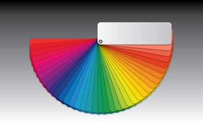
According to research, the most effective colors to use on CTA buttons are red, green, orange, and yellow. The least effective are (unsurprisingly) black, white, and brown. It's also best to use colors and text that stand in contrast to the page, such as the color opposite the page colors on the color wheel. For example, an orange button on a blue page, red button on a green page, or yellow button on a purple page.
2. Work With Your Digital Marketing Agency to Use the Right Words
Steer clear of overused words like "submit" or "enter" and stick with strong action verbs that highlight your value proposition: "get," "reserve," "download," and "try" all work well. Use large, highly legible text. Avoid getting cutesy with the font, because if they can't read your button, your carefully-worded CTA becomes quite useless.
3. Keep It Short & Sweet
Don't bother making a full sentence promise on your CTA button; keep it brief and to the point. Studies show that first person is ideal -- instead of promising, "Get your free copy now," try, "Get my free copy now." Two to five words is ideal for CTA button text. Work with your digital marketing agency to find a way to express your value proposition briefly yet powerfully.
4. Create a Sense of Urgency
Page visitors are more likely to convert to leads if they are afraid the offer won't be available long. Create a sense of urgency by limiting the number of people the offer is made available to (the first 100 visitors ... ), by limiting the time the offer is available (today only ... ), or similarly making the offer seem as if it could disappear any moment.
5. Placement Matters
Whenever you can, keep your CTA buttons above the fold (in the upper half of the page), and avoid using competing buttons on the page so that your visitors won't get distracted and miss the main point of the page. If you do need to use other buttons on the page, make sure that the CTA button is what actually stands out.
6. Use the Negative Space/White Space Effectively
Leave the area around your CTA button open and uncluttered. This white space or negative space serves to draw attention to your carefully-designed and brilliantly-worded CTA button. It's okay to use a little graphic nudge (such as an arrow pointing to the CTA button), but otherwise keep the space open and highly visible to the visitor's eye.
What else should you and your digital marketing agency know about improving your landing pages and website for maximum lead generation and conversions? Download our ebook, the 7 Secrets of Improving Traffic Through Effective Website Redesign now!
No comments:
Post a Comment