If you look at how product pages take shape across different companies, it's clear they run the gamut. Some go for the direct approach, displaying an image of a product and explaining why someone should buy it.
Other companies create elaborate pages with moving parts and fancy, interactive elements.
Still other companies create delightful product pages that give users an authentic experience as they browse through what the company has to offer.

Believe it or not, not all of the most captivating product pages have enterprise-level programming behind them. To give you an idea of what's possible -- from the small business all the way up to the household name -- we scouted out 18 examples that we find truly admirable.
The pages below have mastered their messaging, value propositions, and general product descriptions such that these sites resonate with their unique buyer persona.
(And after checking out these pages, you might want to buy their products, too.)

18 of the Best Product Landing Page Designs
1. Bellroy
Bellroy sells thinner-than-typical wallets. There's value to that -- but what is it, and how do you get the consumer to understand it?
To answer those questions, Bellroy divided its product page into three stages of the buyer's journey -- understanding the problem, how to fix the problem, and how Bellroy can resolve the problem.
There's even an interactive section that shows how the skinny wallet will fill up in comparison to a different wallet. As users move a slider back and forth along a line, both of the wallets fill up with cards and cash, visually displaying the very problem Bellroy's skinny wallet solves.
 [Click here to see Bellroy's full product page.]
2. Wistia
Wistia is a video hosting and analytics company that provides users with detailed video performance metrics. It might sound like a snooze-fest, but let's dive into what really makes this product page stand apart.
First, we're presented with five, colorful graphics illustrating their tools' value propositions. And in case that's all the user really needed to see, those graphics are followed by two calls-to-action.
But, if you continue scrolling, you'll see a video with information about Wistia's capabilities for that video -- calls-to-action, email collectors, video heatmaps, and viewing trends.
One of the best ways to explain a visual platform's features is to demonstrate them on a product page. This one shows users all of Wistia's features and how they work, day-to-day.
 [Click here to see Wistia's full product page.]
3. Square
Square is a mobile transaction company that merchants can use to collect payment from customers -- anywhere, any time, as long as they have a compatible phone or tablet.
The product marketing challenge here is to show why Square is an easier alternative than a typical cash register -- and its product page displays those reasons in a visually captivating way.
Product Description
The main headline of each section of this product page has bold, succinct copy:
"Small credit card reader, big possibilities."
The rest of the page is clearly organized headlines -- which kind of read like answers to frequently asked questions -- plenty of white space, succinct copy, and appropriate images. Anyone looking into each section can understand exactly how Square works at every stage of a transaction.

4. Rent the Runway
Some companies -- especially in ecommerce -- can have up to thousands of product pages. Rent the Runway, an online dress rental company, is one of them.
Rent the Runway has an individual product page for every dress it carries, with all the information a customer could want -- images, measurements, fabric, price, and reviews. So what sets them apart? The exceptional detail of the "Stylist Notes" and "Size & Fit" sections.
Product Description
These details are clearly and carefully curated from stylists and reviewers. They don't just explain what a dress is made of and how it looks -- they cover how it fits on every part of the body, which undergarments should be worn with it, and for which body types it's best suited. That kind of information not only delights customers and encourages their trust, but it also makes for a more confident buying decision.
Also, notice how there's plenty of white space surrounding the product images and description. According to research by ConversionXL, that white space creates a higher perceived value -- in this case, price -- of the product in the user's mind.
 [Click here to see Rent the Runway's full product page.]
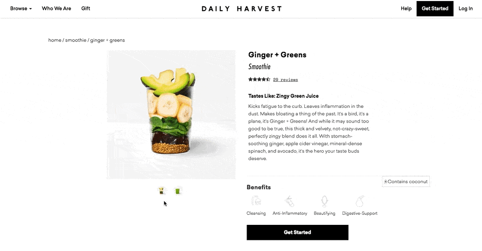
5. Daily Harvest
Daily Harvest develops superfoods in the form of smoothies, soups, and more, and delivers them to your doorstep. What makes these foods' product pages so outstanding? They show you exactly what makes these foods so super in a format that's both clear and digestible -- no pun intended.
Check out one of the Daily Harvest's smoothie product pages, below. Not only can you see what the smoothie looks like, but hovering over the lefthand preview icon, below the main image, shows you the foods used to create this drink. Scroll down, and you'll see each ingredient and a simple description of each one.
Product Description
The product description of this smoothie is just as creative as the landing page itself.
"Kicks fatigue to the curb. Leaves inflammation in the dust. Makes bloating a thing of the past. It's a bird, it's a plane, it's Ginger + Greens!"
 [Click here to see Daily Harvest's full product page.]
6. Oreo
If you've seen any of Oreo's marketing, you shouldn't be surprised they're on this list. But sometimes, being well known can actually make it harder to create a product page. So how did they do it?
The focus of Oreo's product page is how these simple, classic cookies can help people unleash their imaginations, dare to wonder, and become generally happier. It features a series of videos, one after another. One is accompanied by the lyrics, "It's so easy to let your imagination go when you play with Oreo," paying tribute to the age-old discussion about the "best" way to eat them. The page takes a creative, bold approach to marketing with what might otherwise be thought of as an ordinary snack.
Oreo also took a unique design to this page. Even though the cookies themselves are monochrome, the page is wonderfully colorful, from the videos, to the backgrounds, to the graphics.
 [Click here to see Oreo's full product page.]
7. Fitbit Charge
When I took on this blog post, I asked a few people for their favorite product page suggestions. I was amazed how many people immediately recommended Fitbit -- and after checking out the site, I can see why.
The page below helped unveil the original Fitbit Charge -- now succeeded by the Fitbit 3 -- and starts off with a value proposition, rather than a list of features. It's a hero image of people hiking a mountain, who we can imagine are wearing Fitbits, with the copy, "Energize your day."
As you scroll down the page, it goes through four quick steps explaining how the product works. What's more, a lot of these are interactive -- the section under "Everything you need, all in one place" allows users to hover over different features to see how they appear on Fitbit's mobile app.
But the page also explains why these features are valuable. For example, one tracks everything you do from walking, to running, to sleeping. Why does that matter? Well, you can have your current records on hand, and try to beat them.
Knowing that users might not remember all of the specifics when they leave the page, Fitbit was sure to focus on how these features will actually make a difference in the visitors' lives. Well played.
 [Click here for Fitbit Charge 3's new product page.]
8. Volkswagen
Volkswagen takes an interactive approach to its product marketing. Instead of listing out all of the features you can have in a car, the company walk you through the process of actually building your car. As you go through that process, Volkswagen highlights the different features you could choose, then gives you a preview of what the car will look like and how that will affect the price.
Even though I'm not currently in the market for a new car, I personally had fun tinkering with the different customization features on the page. What color do I want? Do I want premium audio? (Yes.) It's an interesting way for the brand to eliminate the notorious connotations of "car salesmen," by allowing users to learn about and select features independently.
Plus, there's a nifty matchmaking feature that allows you to see which nearby dealerships have the car with all of your preferences in its inventory.
(If you want to see a regular product page, they've got that, too.)
 [Click here to see Volkwagen's full product page.]
9. Seattle Cider
The folks at Seattle Cider claim their cider is "not your standard cider." Well, neither is the product page. It reads like a story, beginning with attractive, high-definition images of the cider selection, which happen to have really cool label designs. As you hover, an explanation appears of what differentiates Seattle Cider's products from others, and what makes each variation special.
But my favorite part is what comes next: a really cool, interactive display of how cider is made from start to finish, which plays for users as they scroll. It's a surprising and delightful user experience that goes above and beyond the typical product page, because it doesn't just display the products. It shows where they come from, and how.
 [Click here to see Seattle Cider's full product page.]
10. OfficeSpace Software
OfficeSpace sells facility management software to help folks manage, well, office spaces. Like the name, the product page is very clear and direct.
Each section of this product page is dedicated to a different feature of the software. The headline explains the feature, and the subheadline explains why this feature is important as you evaluate different software.
That makes it easy for prospects to quickly digest what the product offers, but also read more details on its value proposition, if they choose to. And, if someone wants to learn even more about a particular feature, there are clear calls-to-action to do so.
 [Click here to see OfficeSpace's full product page.]
11. Orangina
This carbonated citrus drink has been around since 1935, and it has exactly four products -- original, red orange, light, and tropical. So, how does Orangina keep its product page both current and special?
For one, it's fun to explore. When you hover your mouse over any of the blocks, the picture or icon animates -- the bottles dance around, the orange slices in half, and the thermometer drops. The animated images and bold colors fit in perfectly with the Orangina brand's bold, fun personality.
Also, you might notice that some of the blocks are actual products, while the others are simply tips and details about their products. If you don't have a lot of products to sell, consider interspersing them with tips and information about the products you do have available.
 [Click here to see Orangina's full product page.]
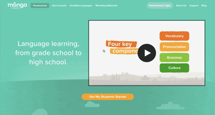
12. Mango Languages
Mango Languages creates "lovable" language-learning experiences for libraries, schools, corporations, government agencies, and individuals. Its homepage has illustrated calls-to-action for each of these buyer personas -- from public libraries, to government offices, to those who are homeschooling their kids. Each of those calls-to-action leads to a different product page that's colorful, clearly written, and very comprehensive.
Take a look at the example for homeschool teachers below. Like every other part of the website, it exudes Mango's friendly, approachable, and helpful brand personality. The video couldn't be more delightful. I mean, a guitar-playing mango in a top hat? Yes, please.
As you scroll, you're greeted with clear value propositions that use playful language that's true to brand. Everything about the page says "simple to use," "fun," and "effective."
 [Click here to see Mango's full product page.]
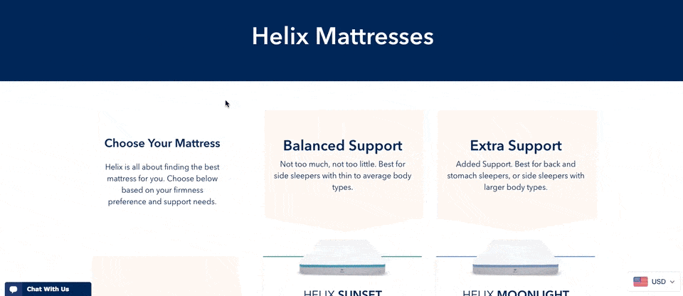
13. Helix Mattresses
It's one thing to sell a mattress -- it's another thing to sell a good night's sleep. Helix Mattresses is laser-focused on the latter, having designed a product page that organizes each mattress by its level of plushness and support.
By looking at Helix's product line in chart form, website visitors don't have to examine each mattress individually to find the attributes they're looking for. Simply find the row and column that matches your bedding needs, and click through to your chosen mattress's product page to learn more.
Product Description
It can be difficult to know what "plush," "firm," or "supportive" really mean in a mattress -- they all seem so subjective. For that reason, Helix is all about brevity in its product descriptions, using evocative explanations of each category a mattress might belong to.
"Plush Feel: Soft top of your mattress that lets you sink in like a cloud."
"Balanced Support: Not too much, not too little. Best for side sleepers with thin to average body types."
"Firm feel: Firm top of your mattress with no sink or give."
 [Click here to see Helix's full product page.]
14. Minwax
Minwax makes products to help people care for their wood furnishings and surfaces. Riveting, right? But the brand has managed to create a product page that's not only relevant, but also, helps users quickly and easily find what they're looking for.
That's thanks partly to the Minwax Product Finder module. It functions like a quiz, asking a series of multiple-choice questions, like "What kind of project is it?" and "What are you looking to do?" Once you answer the questions, the quiz generates recommended products, which includes a handy "Don't Forget" list with the tools you'll need to get the job done -- things like safety glasses, gloves, and sandpaper. Helpful tips like this go above and beyond a normal ecommerce product page.
 [Click here to see Minwax's full product page.]
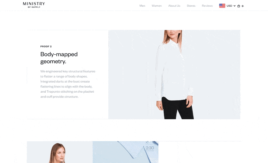
15. Ministry of Supply
Ministry of Supply specializes in comfortable formal wear, and it shows you just how comfortable in any one of its garments' product landing pages.
Take the product page for the Juno Blouse, below. Below the photo gallery of a woman modeling the product, Ministry of Supply gives visitors "proofs," revealing the blouse's thread count, materials, and other key qualities that make the product unique.
The product page's best trait might actually be its motion graphics, using basic looped videos that demonstrate the clothing's resilience and flexibility.
Product Description
Ministry of Supply describes its products' technical benefits but without sacrificing a friendly tone:
"Unlike silk, Juno is designed for everyday performance without the fuss. It's moisture-wicking, breathable, and wrinkle free, so you can dress your best without specialized care."
 [Click here to see Ministry of Supply's full product page.]
16. Liulishuo
Liulishuo is a China-based startup that builds English language learning tools for personal development and test prep purposes. The company's mobile app product page offers a clean but media-rich overview of its curriculum.
As you can see below, the bottom of the page plays a crisp motion clip of the video-based coursework in action on a smartphone. It's essentially an app demo before users even download the app.
At the top of page, Liulishuo makes cool use of QR codes by allowing users to download the app just by scanning the app's QR code on their mobile device. Presenting a software product in this way is a smart effort to increase customer acquisition simply by making the product easier to get.
 [Click here to see Liulishiuo's full product page.]
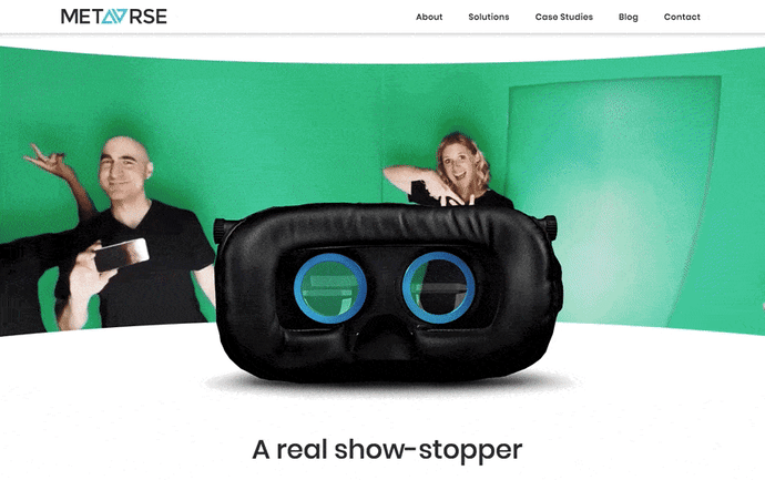
17. Metavrse VR Photobooth™
Metavrse, a virtual reality (VR) consultancy and product developer, has just about the most immersive product page we've ever seen. The company sells not just VR insight, but also VR tools to help modern businesses better engage their customers in their goods and services.
One of those tools, which has a killer landing page, is the VR Photobooth™.
Metavrse's VR Photobooth™ features both a VR headset and an actual cube-shaped room that people enter while wearing the headset for a 360-degree, branded experience. And what better way of demonstrating this experience than right there in the center of the product page? Check it out, below.
Metavrse displays its VR headset facing away from the website visitor, with a moving panoramic background that gives businesses a nearly firsthand demo of what's waiting for them (or, more specifically, their customers).
Product Description
Metavrse elaborates on its VR Photobooth™ via a full PDF, which website visitors can download for free at the bottom of the product page. Regarding the cube-shaped room itself, the company has some enticing but informative product copy:
"Up to 4 guests can enter the booth at once to have their photo taken among a dazzling display of video imagery and mirror magic."
 [Click here to see Metavrse's full product page.]
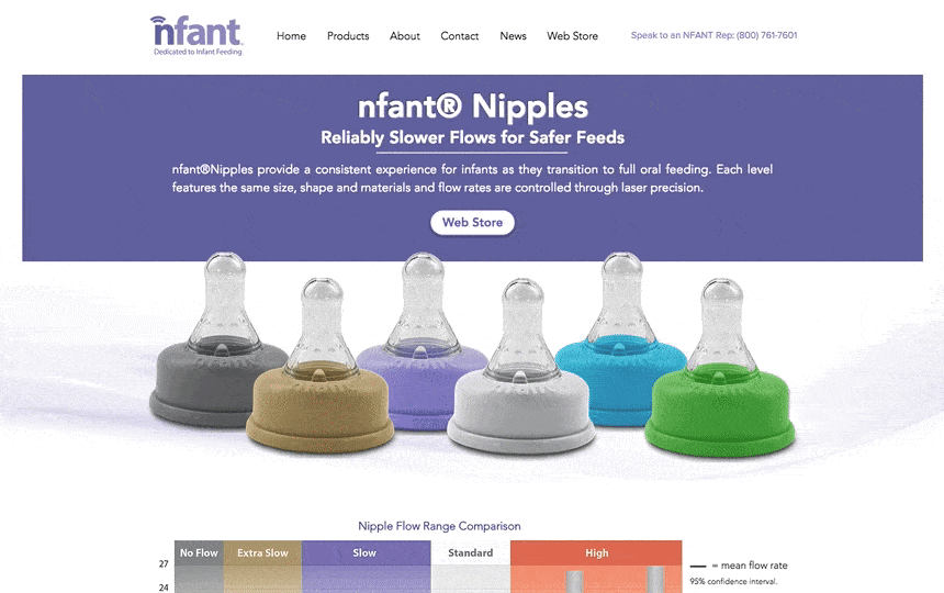
18. Nfant®Nipple
Nfant®, an infant nursing product, takes the transition from breastfeeding to oral feeding seriously -- as is evident on the company's product page for the Nfant®Nipple.
What sets this small business apart from other nursing and parenting services is its use of data to attract customers.
The product page below touts several types of bottle top-shaped nipples, and each one offers a different level of flow when the baby is drinking. As involved as the conditions of each product are, however, the product page delivers the information gracefully using color coordination, a video demonstration, and even a graph comparing each product's flow range that nursing mothers can refer back to.
Nursing moms are always educating themselves on the resources they have for keeping their children healthy as they develop. With that in mind, Nfant's detailed but easy-to-understand product page knows its buyer persona well.
 [Click here to see Nfant's full product page.]
Product Page Best Practices
So, what have these brands taught us about product pages? It boils down to a few must-haves:
- Make it interesting and fun, especially if you have a less-than-riveting product.
- Make it easy for visitors to find what they're looking for.
- Make it personal. Allow users to "build their own" product, to show them that you can meet their preferences.
- Make it informative. Without bogging it down in detail, be sure to include the right pieces of information that will show users what sets your products apart.
Want more website design examples? Check out creative 404 error messages.


No comments:
Post a Comment