
When you think of great website design, you probably think about a website's homepage, or their blog, or their product pages.
But what about a website's 'Contact Us' page?
Far too many website designers put contact pages near the bottom of their priority list in terms of copywriting and design. Think about how many contact pages you've stumbled upon that look like they were built in the 1990s, even if the rest of the website is beautiful and updated.
That, my friends, is a huge mistake. Your 'Contact Us' page is one of the top four most important pages on your website. For most companies, it's typically one of the most-visited site pages.
So, what do great 'Contact Us' pages look like?
Typically, the best contact pages ...
- Explain why someone should contact them, and describe how they can help solve their visitors' problems.
- Include an email and phone number so visitors can quickly find the right information.
- Include a short form using fields that'll help the business understand who's contacting them.
- Include a call-to-action to keep people on their website -- and provide them with another option if they don’t want to complete the form.
- Showcase the company's thought leadership, whether that's by including a list of recent blog posts or articles about the company in the press.
- Link to active social media accounts like Twitter, Facebook, Instagram, and LinkedIn to give visitors a way to engage with the business.
- Redirect to a thank-you page that explains when and how you'll be contacting them.
Ready to get inspired? Below, we've curated 12 examples of some of the best 'Contact Us' pages out there. Check 'em out -- and think about how you can incorporate some of these ideas into your own contact page design. (To browse more 'Contact Us' pages, check out Crayon's ongoing collection of contact page designs here.)
12 of the Best 'Contact Us' Page Examples
1) Tune
There's a lot going well for Tune's contact page: the beautiful design, the calls-to-action, the clearly displayed contact information, and the form below the fold for visitors who want to get in touch with specific inquiries.
What I love the most about their page, though, is how welcoming they are. With copy like "We're Here to Help!" and "Reach out to us anytime and we'll happily answer your questions," it makes visitors feel like they're being taken care of. Many business' contact pages are rather cold -- but the more friendly you make your page's copy, the better you'll make your visitors feel. After all, you should want them to contact you so you can help them and start building a relationship.
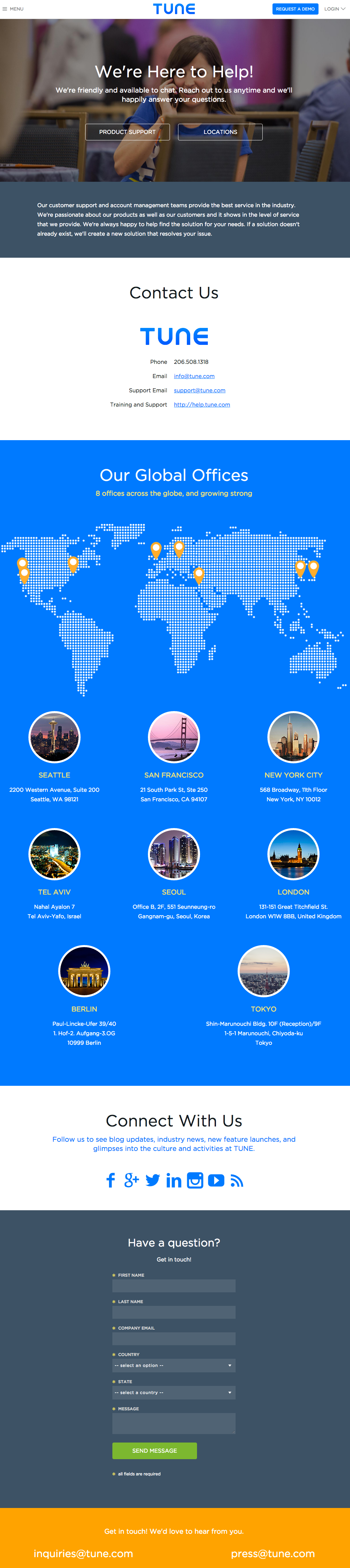
[View the full 'Contact Us' page here.]
2) Achieve3000
Like many businesses out there, Achieve300 has a lot of different types of people visiting their website -- and what these people want to contact them about can vary widely. That's why they've decided to go deeper than the one-size-fits-all approach.
Below that nice hero image and a few words explaining what visitors will get when they contact them, you'll find three options: You can request a demo, you can reach out to a sales rep, or you can get in touch with customer support. Each one of these options leads to a separate landing page, like the one I've included below this screenshot. What a great way to cater to the most common needs of your various web visitors.
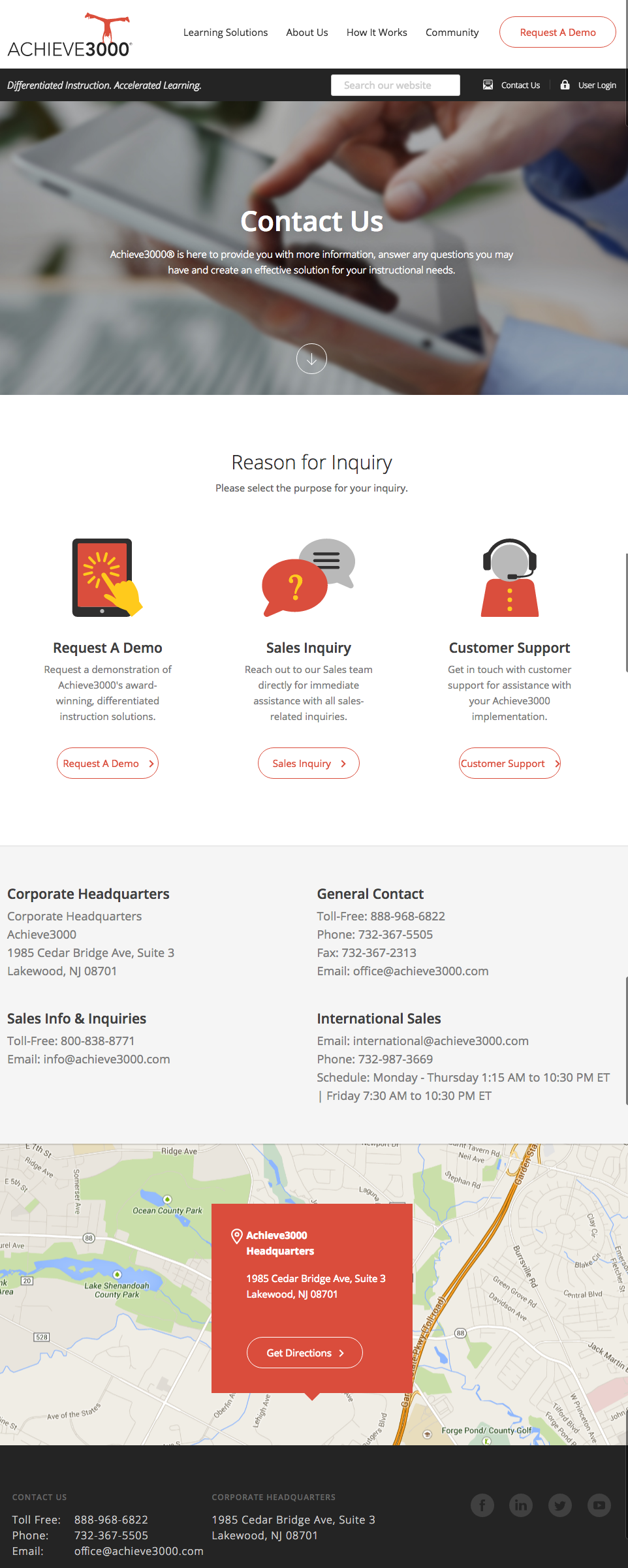
[View the full 'Contact Us' page here.]
Here's the landing page form made specifically for customer support inquiries:

3) Choice Screening
Hands down, the best thing about Choice Screening's 'Contact Us' page is their copy. It doesn't get much better than this -- all starting with that concise, delightful "Talk to a Human" header.
Following all that great copy is a well-organized page with contact information including emails for every different department, followed by a form. The form's a little lengthy for most businesses, but for a business that runs background checks of all kinds, the form fields are likely necessary to help them organize all their inquiries.
When considering how long your own forms should be, think about whether you'd rather have more inquiries coming in, or higher quality inquiries coming in. As long as you have other, easier avenues for folks to contact you, a longer form can be OK for some businesses.
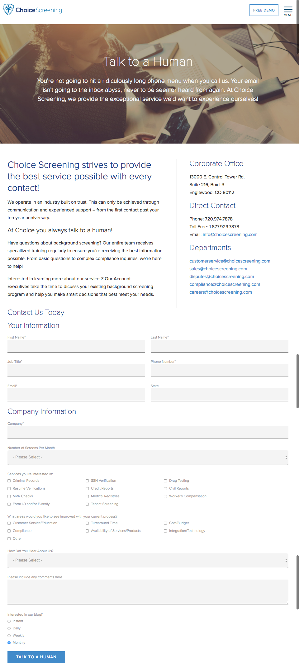
[View the full 'Contact Us' page here.]
4) Atlas 1031 Exchange
At first glance, Atlas 2031 Exchange's contact page doesn't have the sexiest of designs. But when you look closely, you'll realize that it has every single aspect of a great 'Contact Us' page -- and that starts with functionality.
The page explains thoroughly how responsive they are to questions: "We are incredibly responsive to your requests and value your questions." Then they actually list out what people will get when they ask a question, including a promise for a short response time of 12 hours or fewer. The page also includes easy-to-read contact information, social media buttons, links to offers, and even a list of recently published blog posts. Well done.
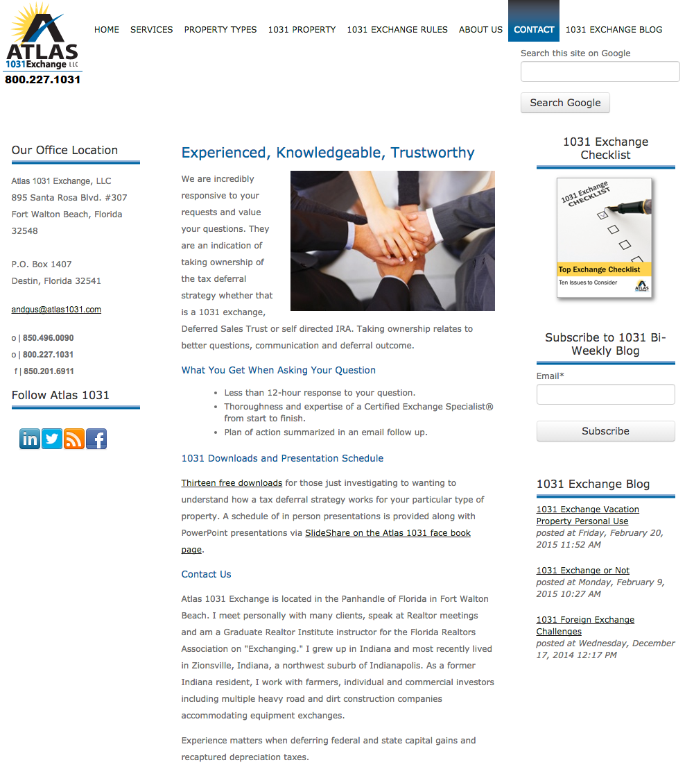
[View the full 'Contact Us' page here.]
5) Morroni
Let's be honest ... these days, most people would much rather fill out a form than get on the phone and talk to someone. When choosing what to ask people in your forms, make sure you choose ones that'll help your specific business understand the person contacting you -- and even help you qualify them as a potential lead.
Of course, some people do like picking up the phone ... hence the delightful quip before the phone number. We also like Morroni's challenge-response test to figure out whether visitors are human: "How's your math? 2+6 = ?."
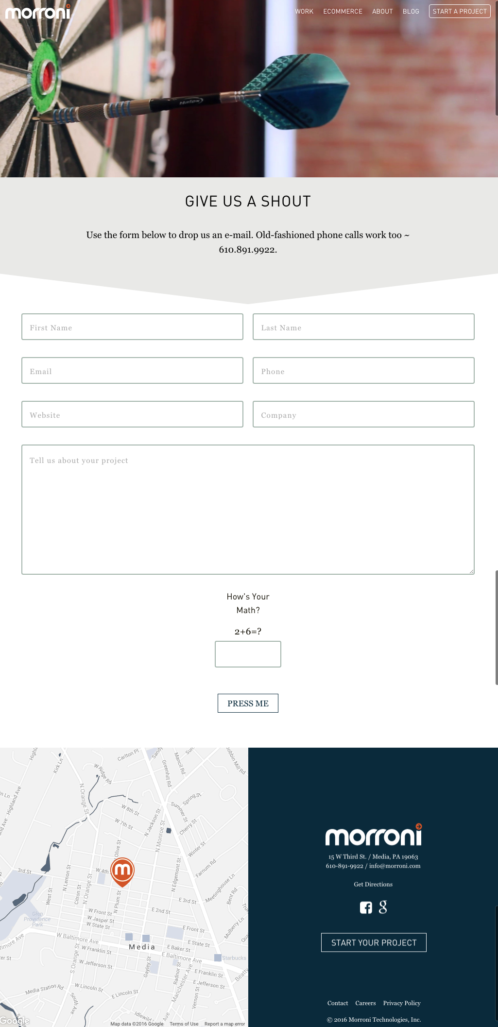
[View the full 'Contact Us' page here.]
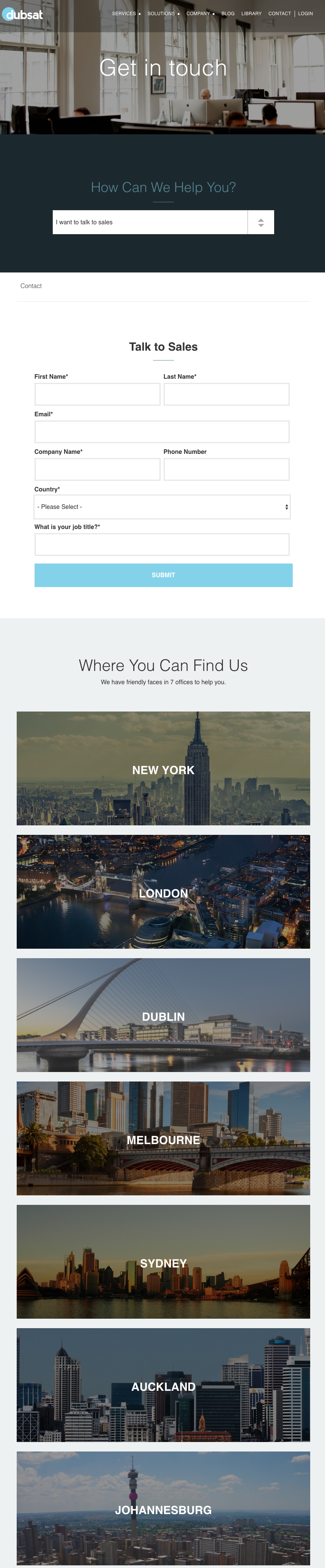
6) Dubsat
"How can we help you?"
That's a classic customer service question -- and if you think about it, isn't a contact page kind of like a place to offer great customer service?
That's how the folks at Dubsat frame their contact page. Below the nice hero image is that simple question, followed by a dropdown menu to help personalize the experience. If visitors choose to talk to sales, they'll see one form show up below the fold. If they choose to get support for one of Dubsat's specific services, they'll see another one show up.
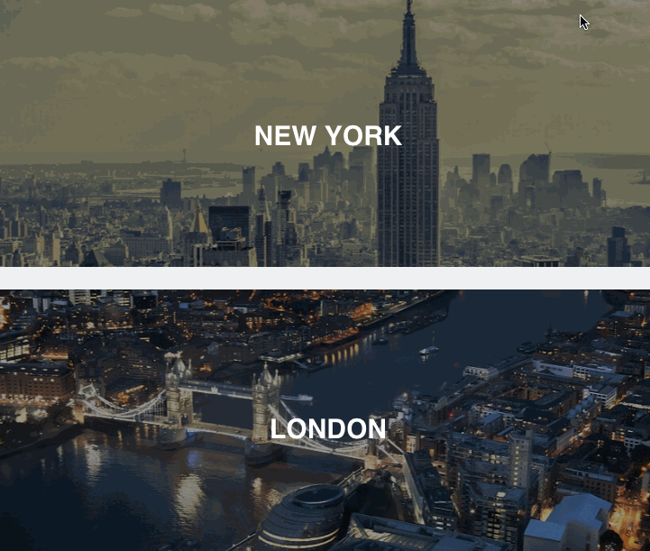
They also show their general contact information in a fun way, too. Keep scrolling and you'll find a visual list of the cities where they have locations. Hover your mouse over those cities, and the image changes to that location on a map, along with all the necessary contact information. Very beautifully and cleverly designed.
Here's what the whole page looks like:
[View the full 'Contact Us' page here.]
7) Pixpa
You'd be surprised how many 'Contact Us' pages don't include a call-to-action. Although the main purpose of your contact page is to help people get in touch with your company, there'll always be folks who land on the page and don't want to fill out the form. That's where a little secondary CTA can fit in nicely.
It can be as simple as a button leading to your blog. Or, it can lead people to demo your product, download a how-to guide, or watch a video. The folks over at Pixpa chose to add a CTA at the bottom of their 'Contact Us' page for a free trial. That way, they're providing value to the folks who land on the page and really just want to talk to a sales rep directly.

[View the full 'Contact Us' page here.]
8) PeopleMetrics
Sometimes, the simplest approach is the best approach. PeopleMetrics' contact page is clean, well written, and does exactly what it's supposed to do. They know that most of the people who land on their contact page are scanning for the easiest and best way to get in touch, so they didn't let any heavy design get in the way.
To make people's lives even easier, they let you use your Facebook or Google Apps login, shortening the conversion path even further. Plus, we love how conversational and fun the copy is: "Feeling formal? Then fill this out and we'll get back to you."
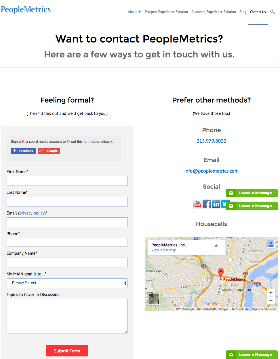
[View the full 'Contact Us' page here.]
9) Legalia
Here's another contact page with a clean, functional design. All the information you need to know, including a short form, is consolidated into a smaller space that doesn't feel crowded. One way they accomplish this is by changing those large images of the building into maps of the locations -- which you can do by clicking the "voir le plan" ("view the map") button below the address.
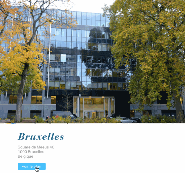
I'd also like to point out a small but important detail for businesses who have international customers. Check out how Legalia included the prefix for their country's code when listing their contact phone number. Many people overlook this if they aren't used to dialing international prefixes themselves, but it's really helpful for your international colleagues and clients to have it right on there. Here's a list of country codes if you don't know yours.
And here's what the whole page looks like:
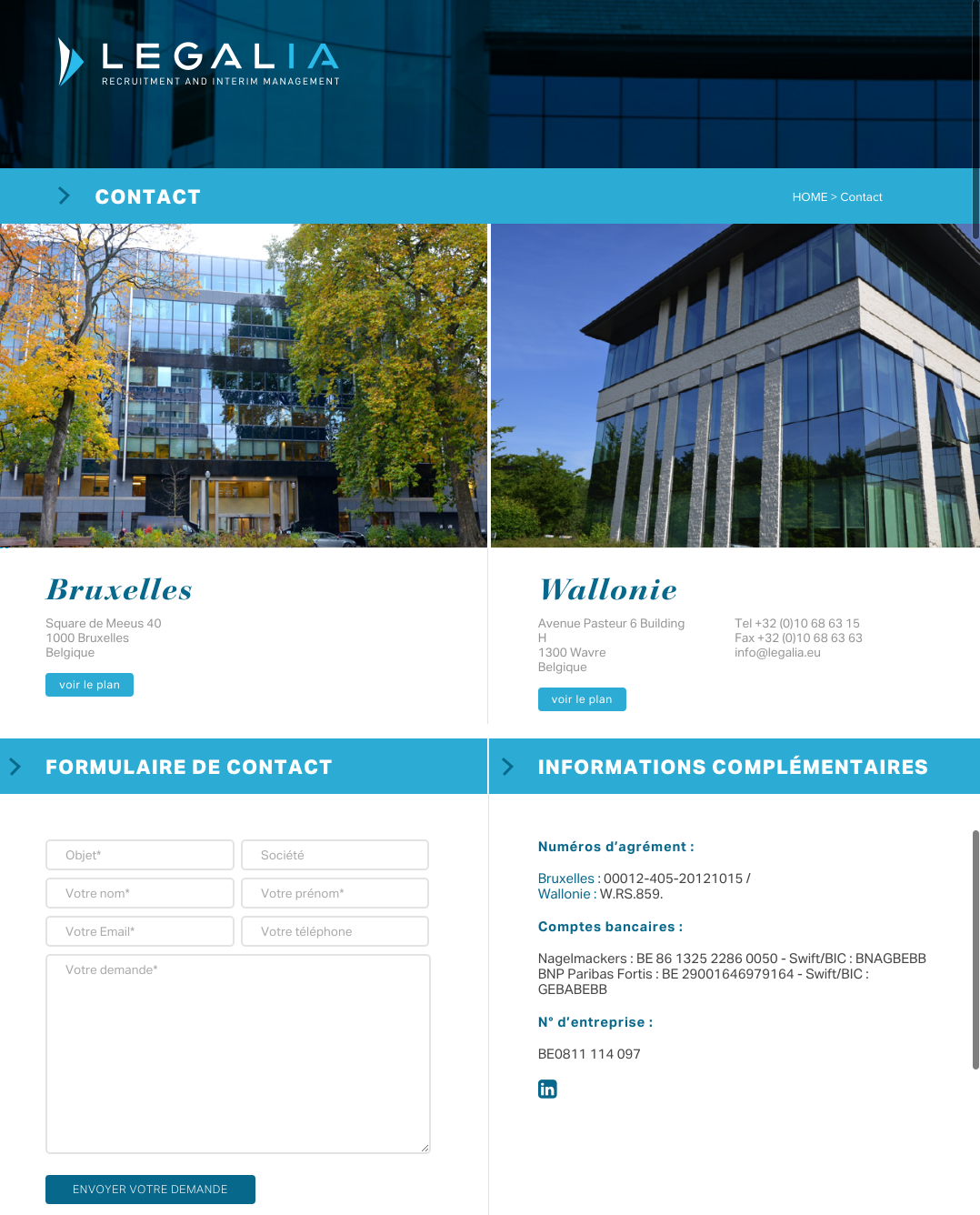
[View the full 'Contact Us' page here.]
10) Elluminati
The folks at Elluminati focus their page on location, starting with the hero image at the top -- which is actually an embedded Google Map of their location. Users can click on the map, zoom in and out, and search for directions from the Google Maps app right from that embedded map -- which is helpful for everyone, including mobile users.
And while white text can be a bit jarring in some cases, it works well against the eye-catching, block color background. We also love the more subtle, very smooth-looking design elements they've included, like the social media buttons that fill in with color when you hover your mouse.

Here's what the whole thing looks like:
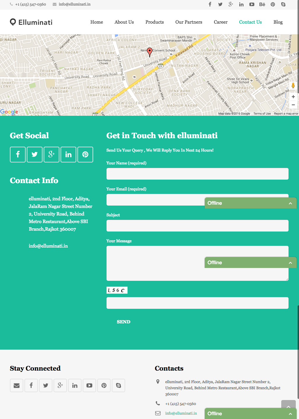
[View the full 'Contact Us' page here.]
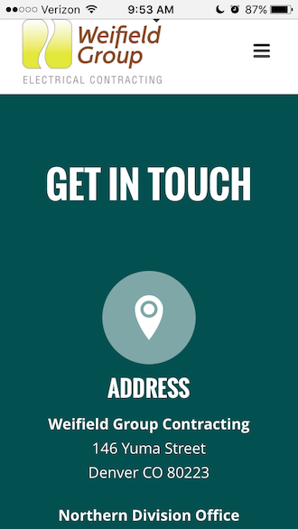
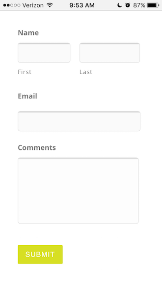
11) Weifield Group Contracting
With the continuing rise of mobile web browsing and Google heavily favoring mobile-friendly websites on their search engine results pages, it's important that all pages on your website -- including your 'Contact Us' page -- are mobile-friendly.
This includes simplifying your navigation, keeping forms short and sweet, including large CTA buttons that are easily tappable with a thumb, and large form fields that make it easy for folks to fill it out on their mobile devices instead of having to pinch and zoom.
The Weifield Group's contact page is a great example of one that is mobile-friendly and responsive. Check out the desktop version of their contact page first, followed by their contact page on mobile -- and note how they've optimized every part of their page for mobile. The text is large, the form fields are easy to fill out, and their CTA button is large and easily tappable, making for a much more seamless mobile experience.
Here's the desktop version:
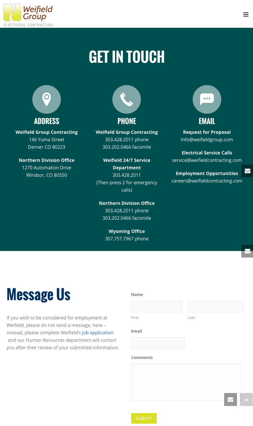
[View the full 'Contact Us' page here.]
And here's the mobile version:
HubSpot Customers: If your website is on the Content Optimization System (COS), then your site is already mobile-friendly from a technical point of view. The HubSpot COS uses responsive design to adapt to any mobile device and fully passes the sniff test on Google's new algorithm.
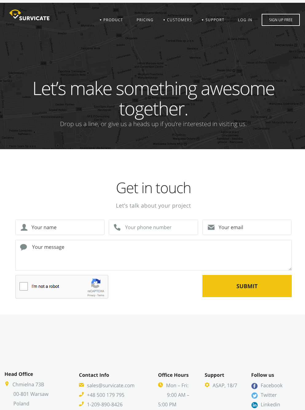
12) Survicate
Survicate's contact page is another example of a beautifully simple layout combined with friendly, welcoming copy. I love the subheader below the fold and just above the form, which reads: "Let's talk about your project." That kind of conversational, colloquial language is exactly the kind of copy that makes visitors feel closer to a brand.
The form itself is simple, with large form fields and CTA buttons -- making it very mobile-friendly. Below that, they've laid out all the typical contact information -- office address, phone number, email, hours of operation, etc. -- in a way that's easy to read and scan.
Finally, I love that their icons and primary CTA reflect the same color yellow as their logo. All of these simple touches make for a clean, visually appealing design.
[View the full 'Contact Us' page here.]
So there you have it: a list of some of the best 'Contact Us' pages out there. Take a look at your business' contact page and see how it stacks up -- or if there are any changes you can make to give your site visitors a better, easier, and more enjoyable experience.
Which great 'Contact Us' pages have you found that are worth adding to this list? Share with us in the comments below.

No comments:
Post a Comment