You’ve probably seen a lot of blog posts floating around the internet about A/B testing successes. This blog is no exception.
But hardly anyone talks about their failed experiments. I don’t blame them–it’s hard to expose to the world that you weren’t right about something.
Which leads us to believe…is anyone running failed, insignificant tests? I mean, if no one’s talking about it, it must not be happening, right?
Let me tell you a secret: Everyone is failing. Everyone is running or has run an experiment that got them nowhere.
However, at Kissmetrics, failure is part of our A/B testing process. If none of our tests fail, we know we’re not running enough tests or our ideas are too safe.
In fact, the bigger the failures, the closer we are to an even bigger win.
We’re never 100% correct about our hypotheses. No matter how many years of experience you have, no matter how much you think you understand your customers…there’s always room for learning.
Otherwise, why would we test in the first place?
Now let’s take a look at a couple of our own failures so you can see what I mean.
Failure #1: Too much white space on our product page
Test Hypothesis: There’s too much clutter at the top of the page. By removing the background image and reducing white space, we’ll make the page copy more visible, enticing people to scroll down and interact more with the page.
You already know that this test failed, but just from looking at the hypothesis–do you know why?
I’ll give you a hint: it has a lot to do with data.
We technically had data that indicated a dip in conversion on this page.
Control:
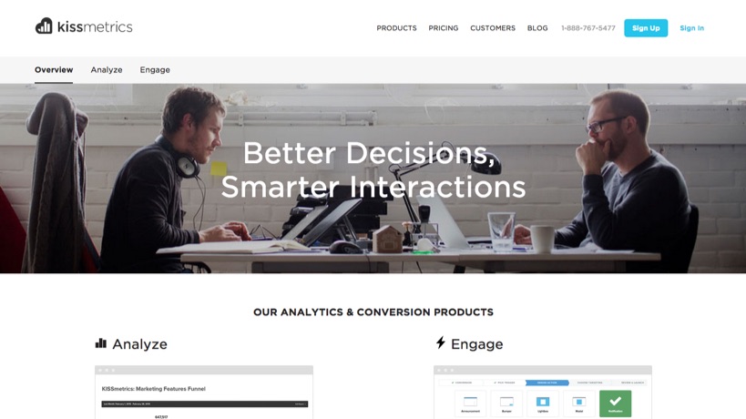
Variant:
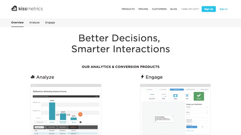
However, we didn’t have evidence that people weren’t scrolling down, or that the space at the top was stopping them from converting. When a hypothesis has little or no evidence, we have a slim chance of winning the test.
Results:
Signups:
Improvement over original: 4.41%
Certainty: 55.27% for the variant
What we learned:
No significant data here.
Having a hero image or not in this page won’t influence our conversions. In previous homepage tests, our hero image mattered, but perhaps not on this exact page.
In previous tests on this particular page, we experimented with the copy and overall messaging. Therefore, our next test should be around the copy to see if we’ll get a lift.
Failure #2: Copy and images on the product page
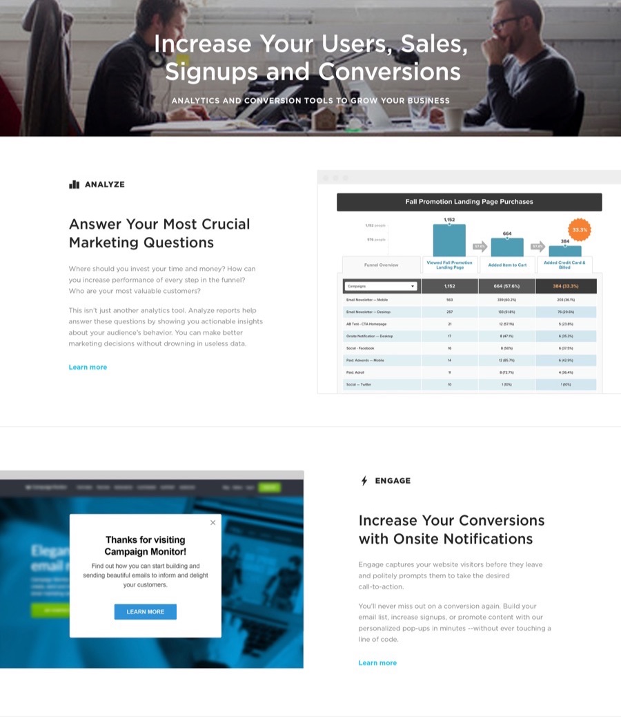
Test Hypothesis: A more benefits oriented product landing page will lead to better quality leads.
Control:
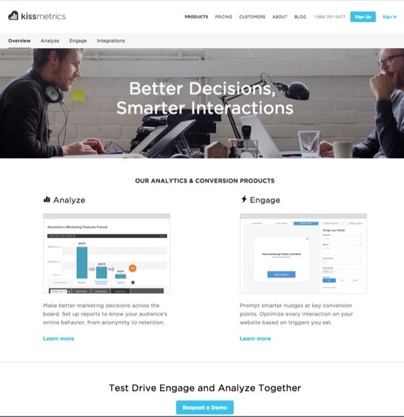
Variant:
Results:
Signups:
Improvement over original: -13.68%
Certainty: 80.12%
Activated:
Improvement over original: 8.77%
Certainty: 60.78%
What we learned:
In the last test (failure #1), we didn’t change enough of the page for there to be significant results.
This time, we changed 1) the copy, 2) product screenshots, and 3) the overall layout of the page below the hero image.
That’s a lot, right?
Here’s the thing: when we change both copy and design, it’s hard to tell whether it was the copy or the design was the reason for a lift or a decrease. We can’t isolate the variable and know what was responsible for the outcome.
In previous tests, tested the copy first, then test the design after. That’s what we’ll do for our next test.
The Win: Product page headline
Test Hypothesis: Adding a benefit centric headline to the product page will increase demo requests and signups because we’re showing them the the value they’ll get from Kissmetrics. All our happy customers have said in interviews they love seeing individual user behavior in Kissmetrics. But we’ll take that one step further and add the result to the end of the headline.
Control:
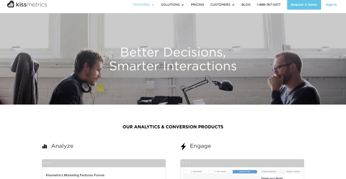
Variant:
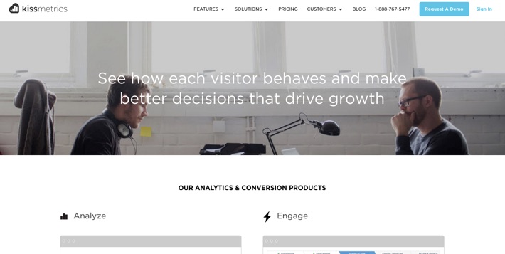
Results:
Signups:
Improvement over original: 163.46%
Certainty: 97.33%
Requested Demo:
Improvement over original: 507.97%
Certainty: 99.67%
What we learned:
Finally, a win! And it only took us 2 failed tests to get there. Not bad.
The increase in requested demos is huge. We didn’t see 99% significance on the signups, so we can’t say for sure that’s a win–but a 507.97% in demos is worth launching.
The major learning here is that the headline on our product page carries a lot of weight. We didn’t change the rest of the page, or the Call to Action copy. A good next test would be to test the rest of the landing page copy to see how much weight it carries.
And finally, having user interviews and user reviews made our hypothesis strong. Yes, benefit-centric copy is a good thing, but what benefit? What do our ideal customers absolutely love about our product?
Having this research evidence from our customers made the win even bigger.
Conclusion
All failures lead to a big win when you’re extracting a major learning from each test. The best part about these learnings is that they’re unique to YOU and your company–meaning, one test that worked for us might not work for you.
However, the best way to get these learnings and big wins from your A/B testing is to have a top notch system in place.
At Kissmetrics, our A/B testing program isn’t only about optimizing our conversions. We’re optimizing the system of testing…that eventually leads to more conversions.
If you want to learn how to get major A/B test wins, join our free email course to learn:
- The proven system of testing we’ve used to triple our conversion rate (most companies spend years trying to figure this out)
- A foolproof checklist for ensuring each test can lead to a big win (Yes, this can work for you if you apply it correctly. We’ll show you how)
- What we learned from over 70 tests we’ve run on our website–including the #1 mistake even the most seasoned professionals make that could negatively impact your funnel
About the Author: Allison Carpio is the Product Marketing Manager for Kissmetrics.
No comments:
Post a Comment